SERVICES:
Brand Identity, Packaging, Photoshoot Direction, Leaflet Design, & Shopify Website Design (No Development)
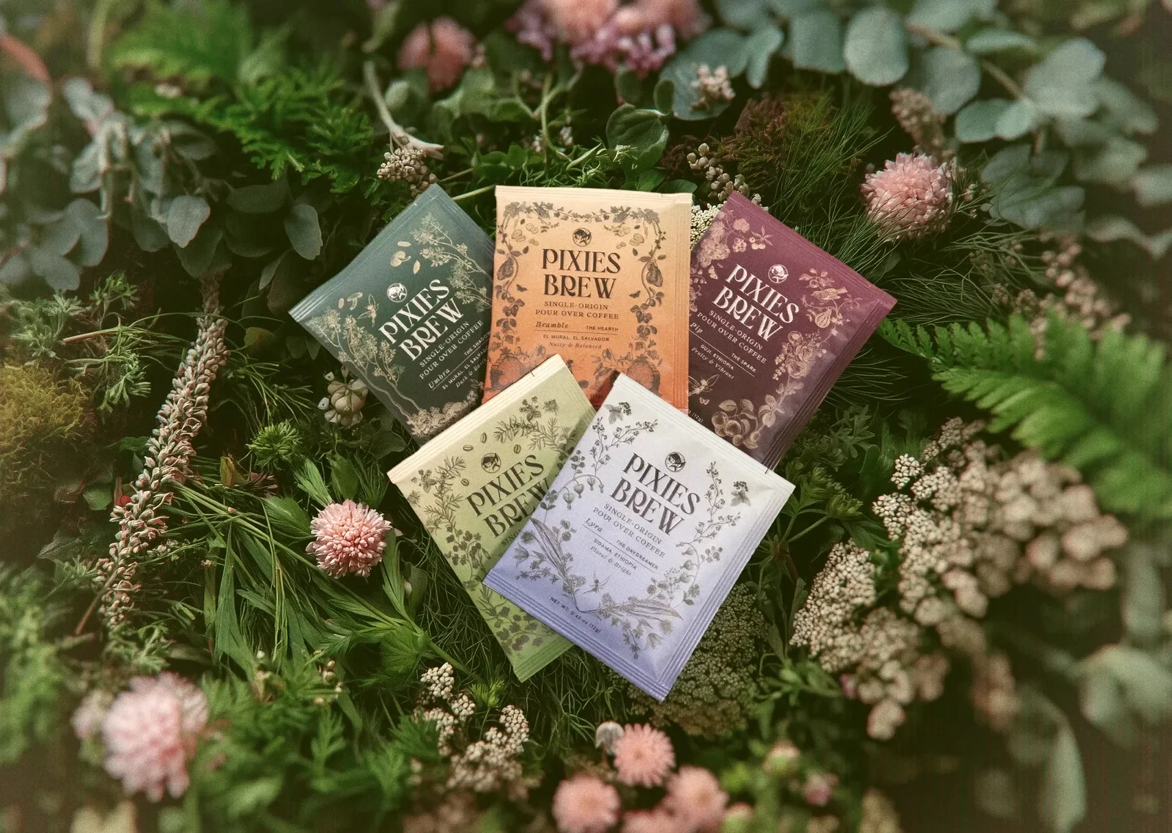
Pixies Brew is a portable pour over coffee brand with a touch of magic woven into every packet.
Each single-serve pour over delivers thoughtfully crafted flavor and a hint of whimsy, turning an everyday cup of coffee into a tiny moment of adventure. The brand invites coffee lovers to slow down, savor the ritual, and enjoy a brew that feels both convenient and delightfully unexpected. I created the full visual identity and packaging system, bringing the playful, pixie-inspired world to life through color, illustration, and storytelling. I also designed a website that feels warm, imaginative, and easy to shop, giving customers a simple path to discover each blend and brew great coffee anywhere.
“Whitney has amazing eyes for style and visual cohesiveness.
She is very professional, super responsive, and very efficient in putting the work together. She was also flexible in taking on additional scope of work when the project required. The result were amazing and I feel like the brand and package design were very much aligned with my vision - which is all I could ask for! Highly recommended and would work with again. Thank you Whitney!”
Faye, Founder of Pixies Brew


Meet Pixies Brew
Pixies Brew is an emerging coffee brand that mixes great flavor with playful imagination. Their pour-over packets come in five Pixie Profiles, each one tied to a unique personality and flavor story. The brand feels earthy, colorful, whimsical, and just cheeky enough to brighten someone’s morning before they even take a sip.
The founder had a vivid world in her mind and a clear sense of how she wanted customers to feel. What she needed was a design partner who could turn that world into a complete brand experience that held together across packaging, digital touchpoints, and storytelling.
The Challenge
There were many creative ideas but not yet a structure that tied everything together. The brand needed clarity and cohesion before launching to customers who would be meeting Pixies Brew for the very first time.
Pixies Brew needed:
a unified brand identity that could support five distinct Pixie personalities
packaging that felt imaginative but still informative and clear
a warm, playful voice that made the experience fun instead of chaotic
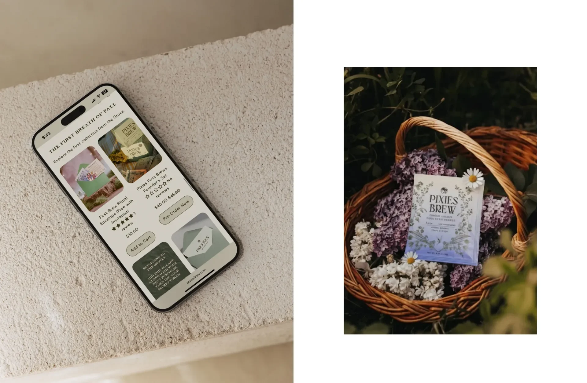
a website and supporting materials that made it easy to shop by flavor or by personality
The founder wanted the brand to feel surprising and delightful without losing professionalism or polish.
The Approach
My goal was to create a brand world that felt fully alive. Every design choice needed to reinforce the idea that Pixies Brew is not just coffee but a small adventure in every packet.
Typography
I chose sleek and bold typefaces to carry the cheeky confidence of the brand. The typography brings structure and clarity, which balances the softness of the illustrations and keeps the brand from feeling overly whimsical.
Illustration system
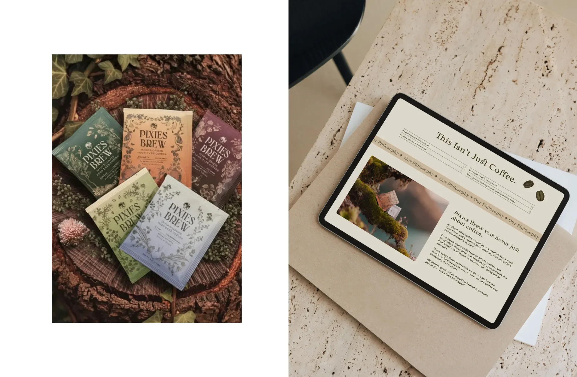
Each Pixie Profile needed its own spirit. The soft illustration style allowed every character to express its personality with charm and detail. These visuals created an immediate emotional connection for customers exploring the flavor lineup.
Color palette
Earthy tones grounded the brand in nature while supporting the fantasy-inspired theme. The colors also helped unify the five personalities so everything felt like part of the same world.
Brand hierarchy
With multiple Pixie Profiles, there had to be a strong master brand system. I established structure first, then created space for each character to shine within it.
Packaging decisions that shaped the customer experience
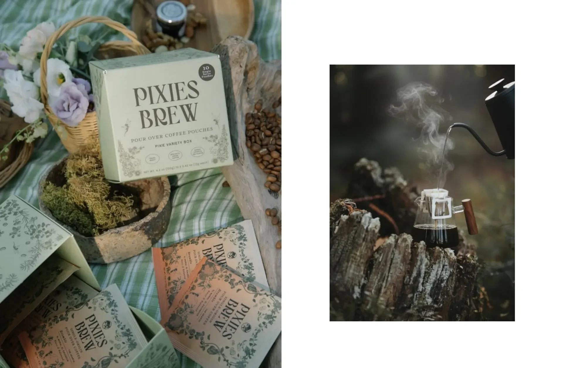
Packaging is often the first touchpoint for coffee shoppers. It has to be beautiful, clear, and helpful. Every panel, flavor note, and illustration served a purpose.
Informational panels
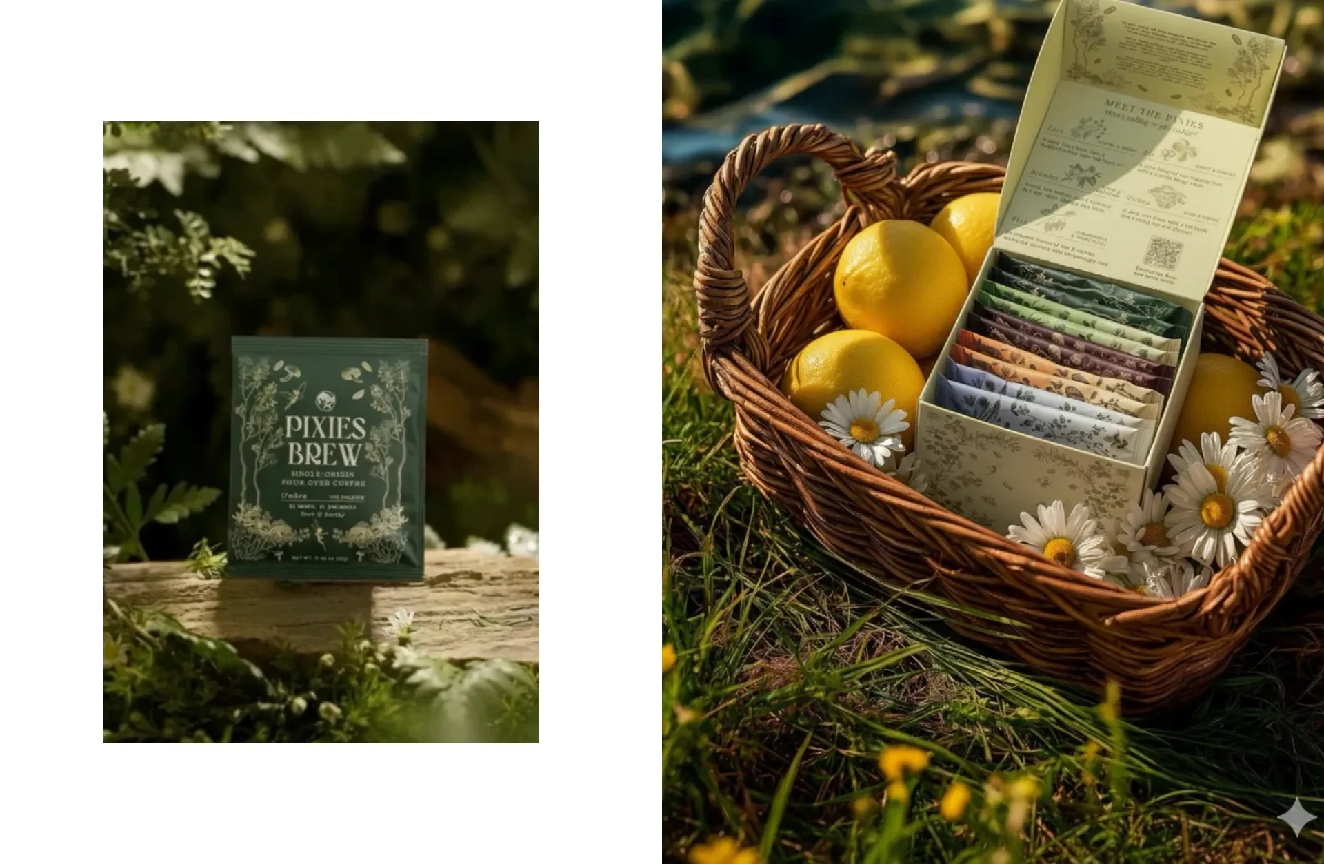
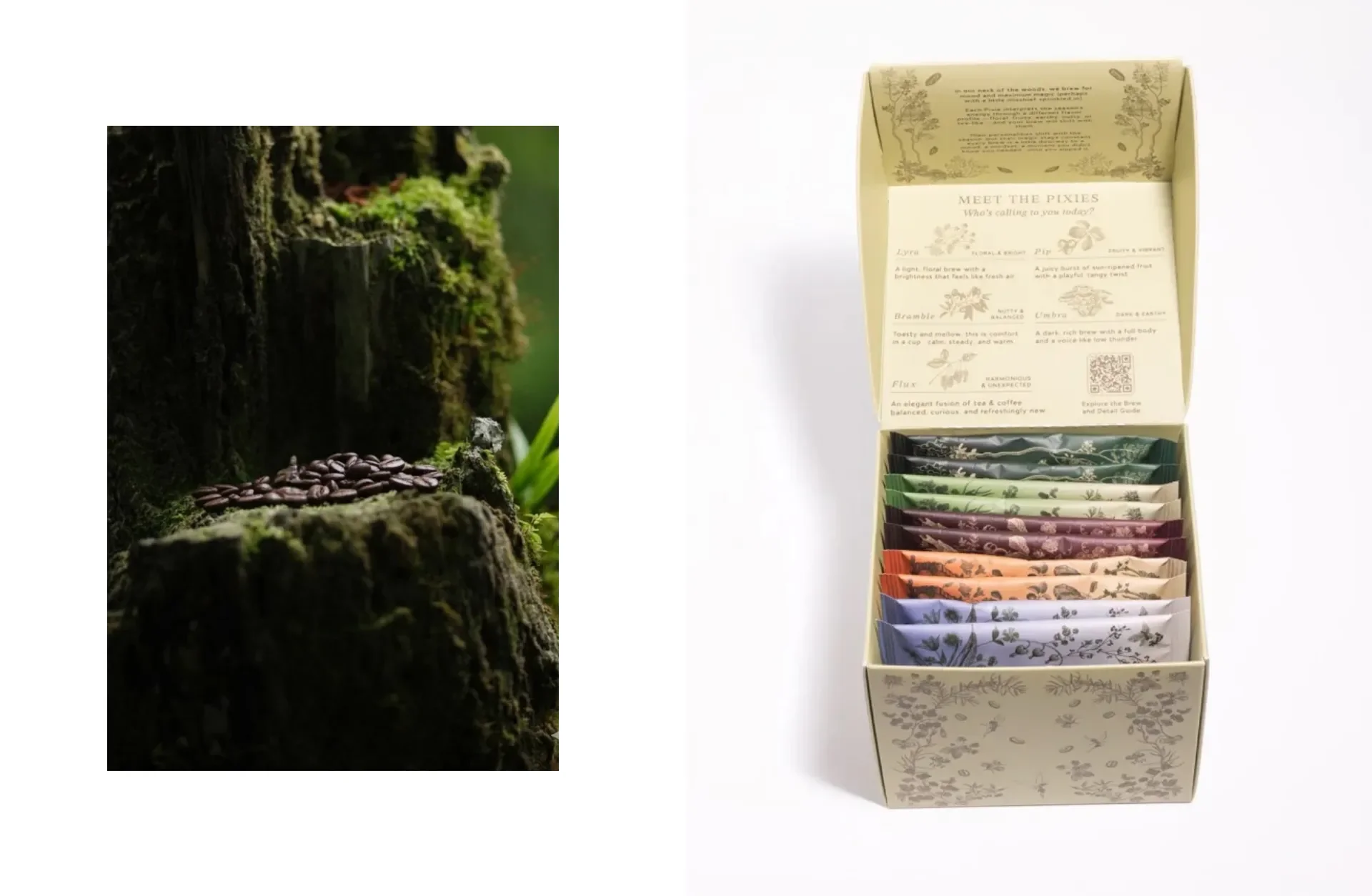
The box features clear flavor descriptions, origin notes, and an overview of all five Pixie Profiles. Customers can understand the full lineup at a glance.
Pixie Profile breakdown
One side of the box showcases each Pixie Packet along with tasting notes and mood indicators. This helps customers choose based on personality or flavor preference, which adds a playful discovery moment to the shopping experience.
Individual packet design
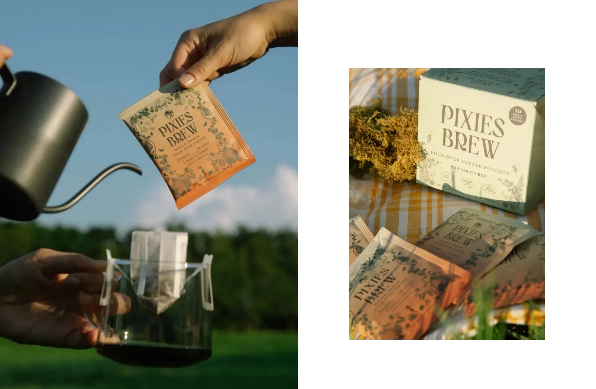
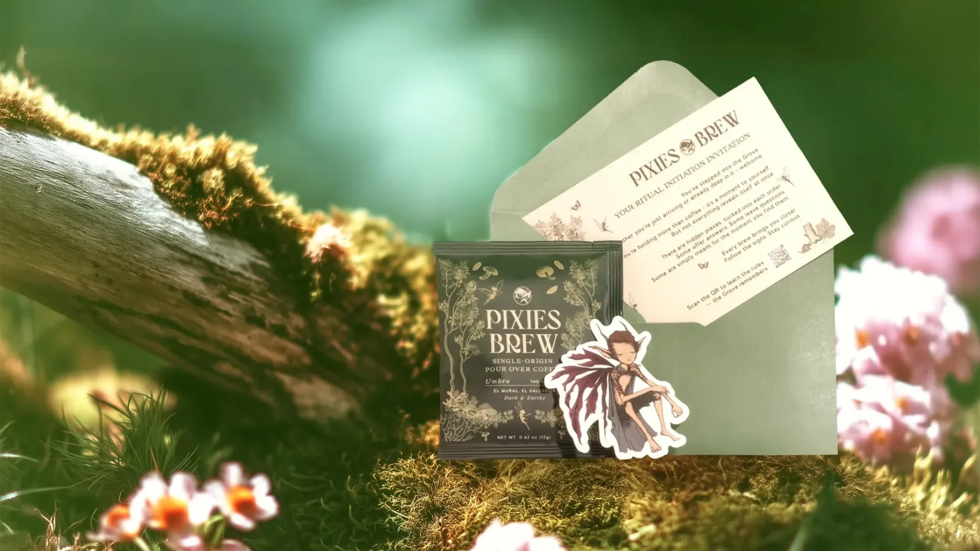
Each pour-over packet has its own illustration tied to flavor notes. A QR code links directly to the website for customers who want a deeper look at the Pixie backstory or brewing instructions. The packets feel collectible, engaging, and uniquely their own.
Consistency across the brand
Even with five personalities, the brand still feels cohesive. That consistency is what makes a themed product line feel credible and ready for retail.
Expanding the brand beyond the box
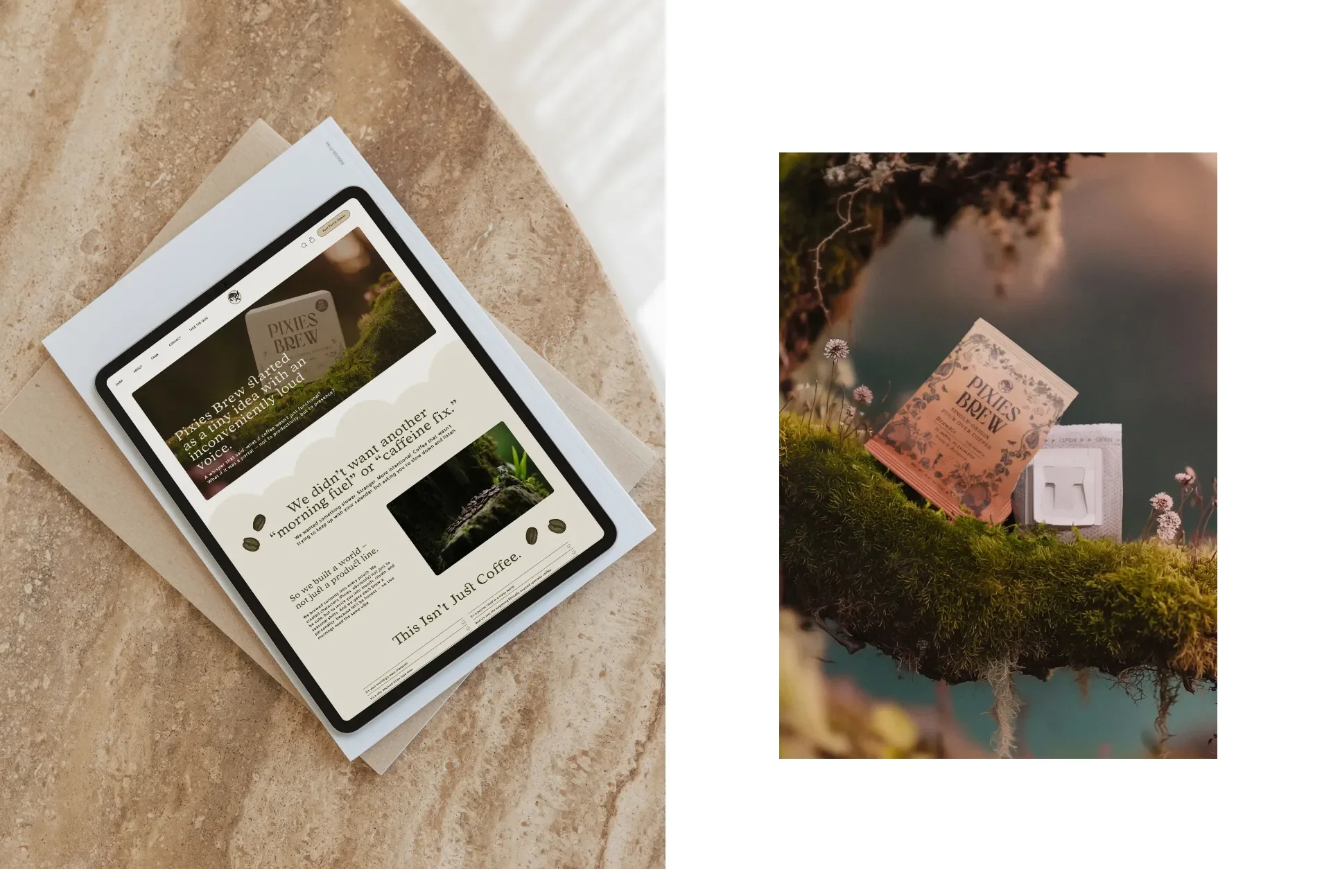
A strong identity should translate across every customer interaction. The brand needed to hold up not only on shelves but also on screens, in hands, and in photos.
Website Design (no development)
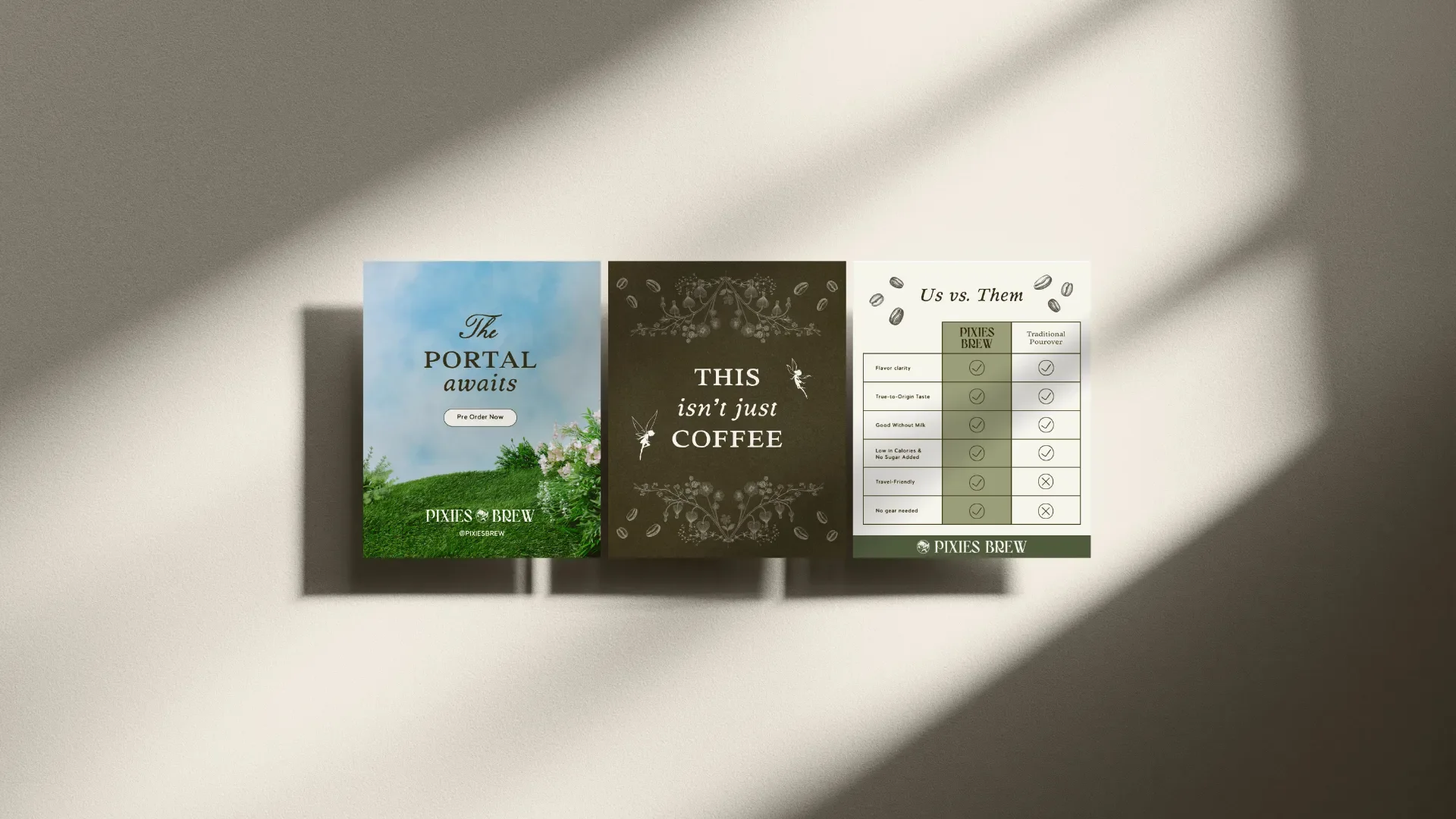
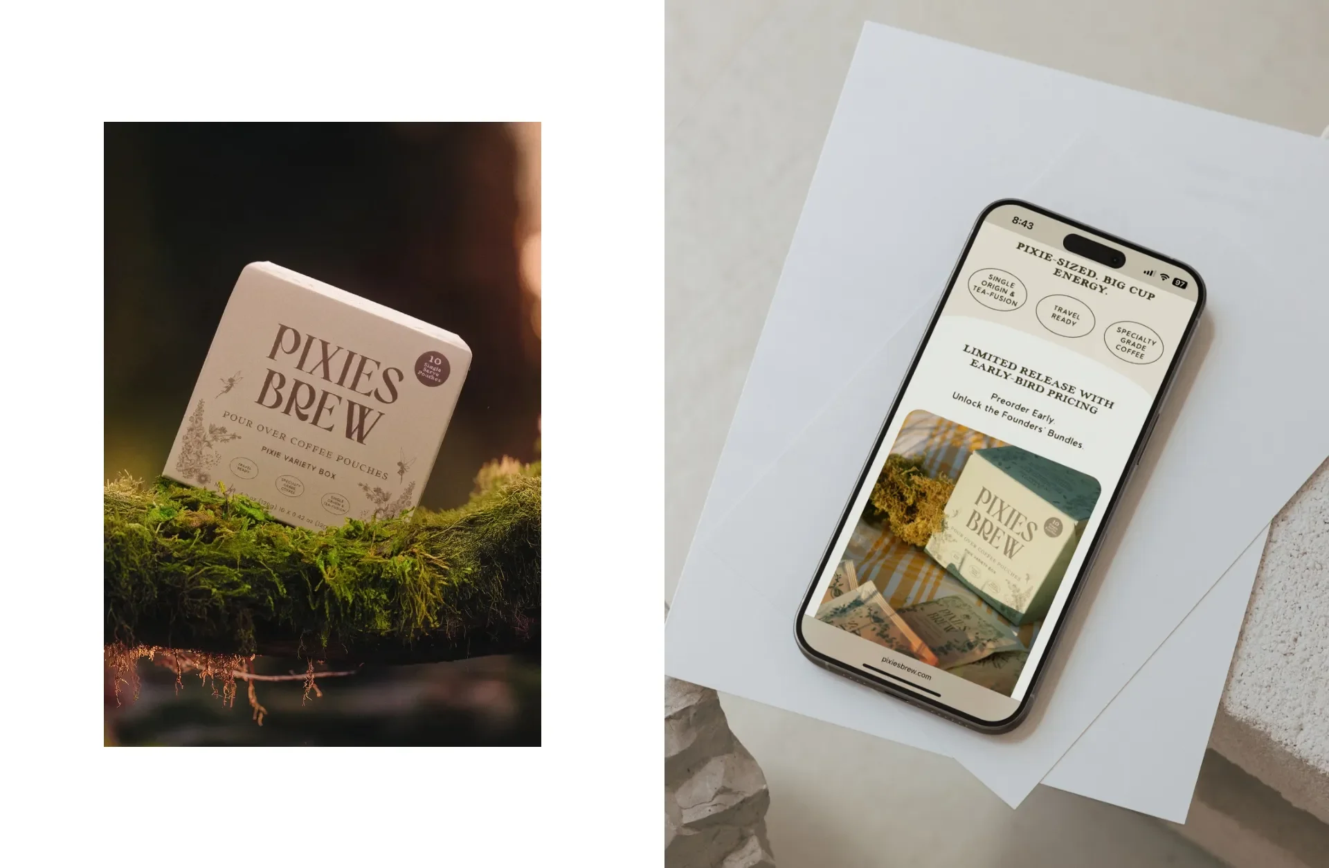
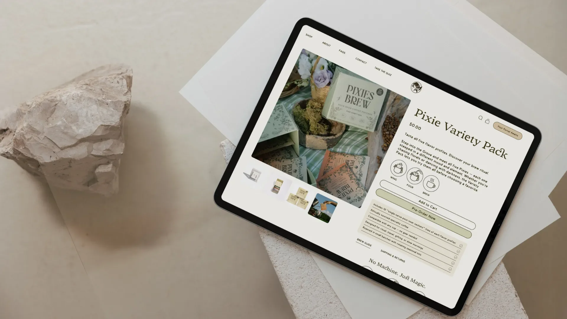
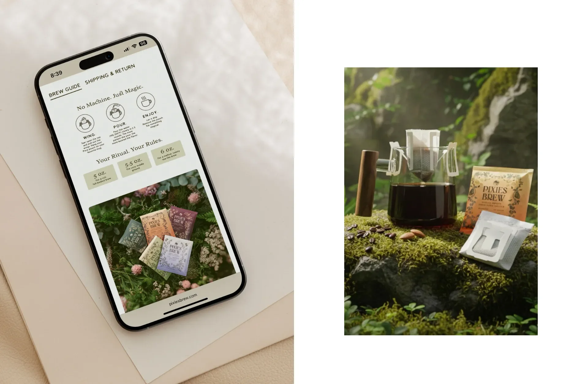
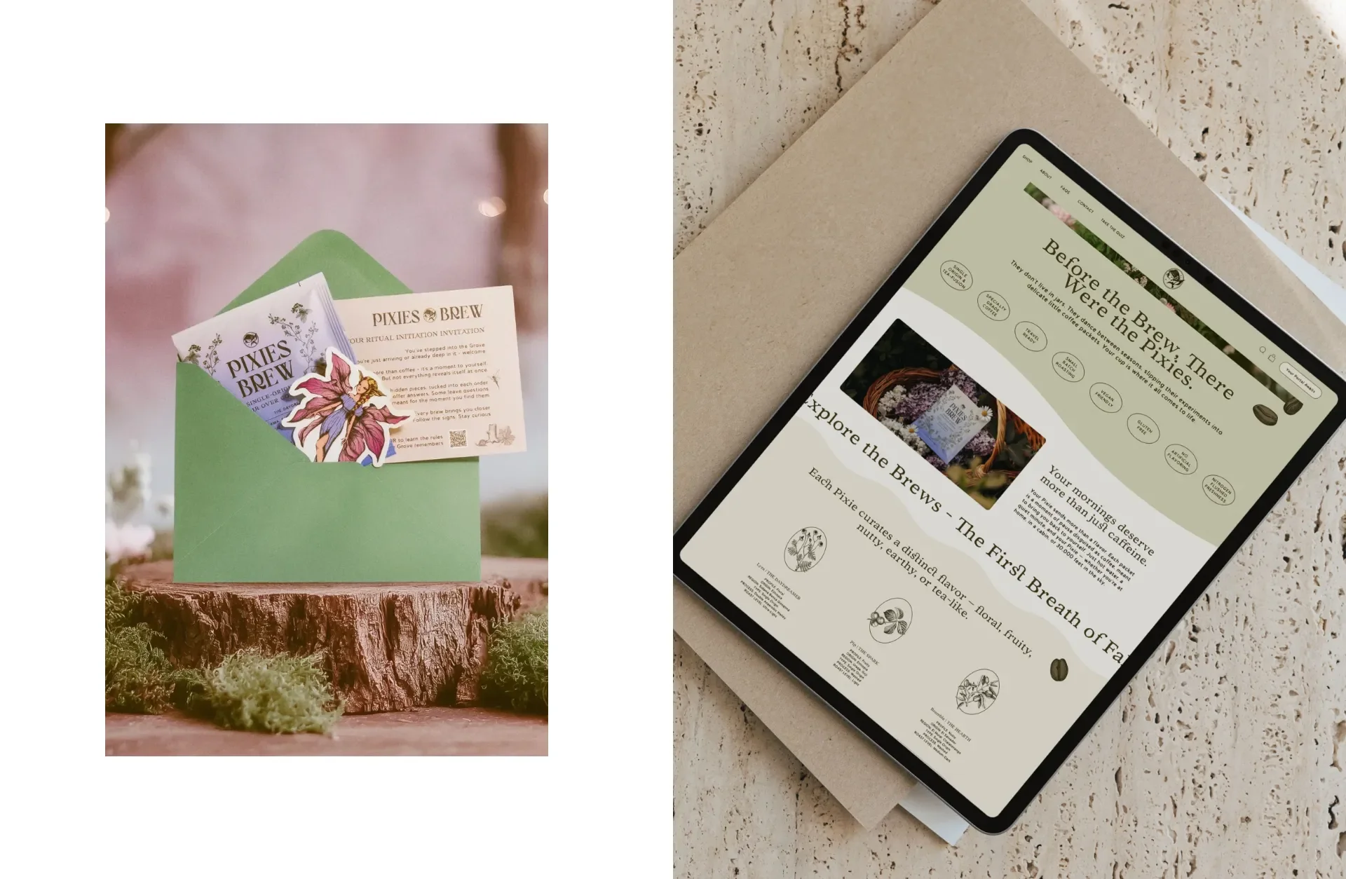
I brought the same color story and illustration style into the website. Clear navigation helps customers shop by flavor, personality, or bundle. The site uses storytelling to make exploring the brand feel intuitive and fun.
Packaging copywriting
Each Pixie Profile has its own voice, but the overall tone stays warm and cheeky. The copy is simple to read, easy to understand, and full of personality.
Leaflet and print collateral
I designed a brand leaflet that walks customers through the Pixie world and explains each flavor. The goal was to make the experience feel immersive without being overwhelming.
Photoshoot creative direction
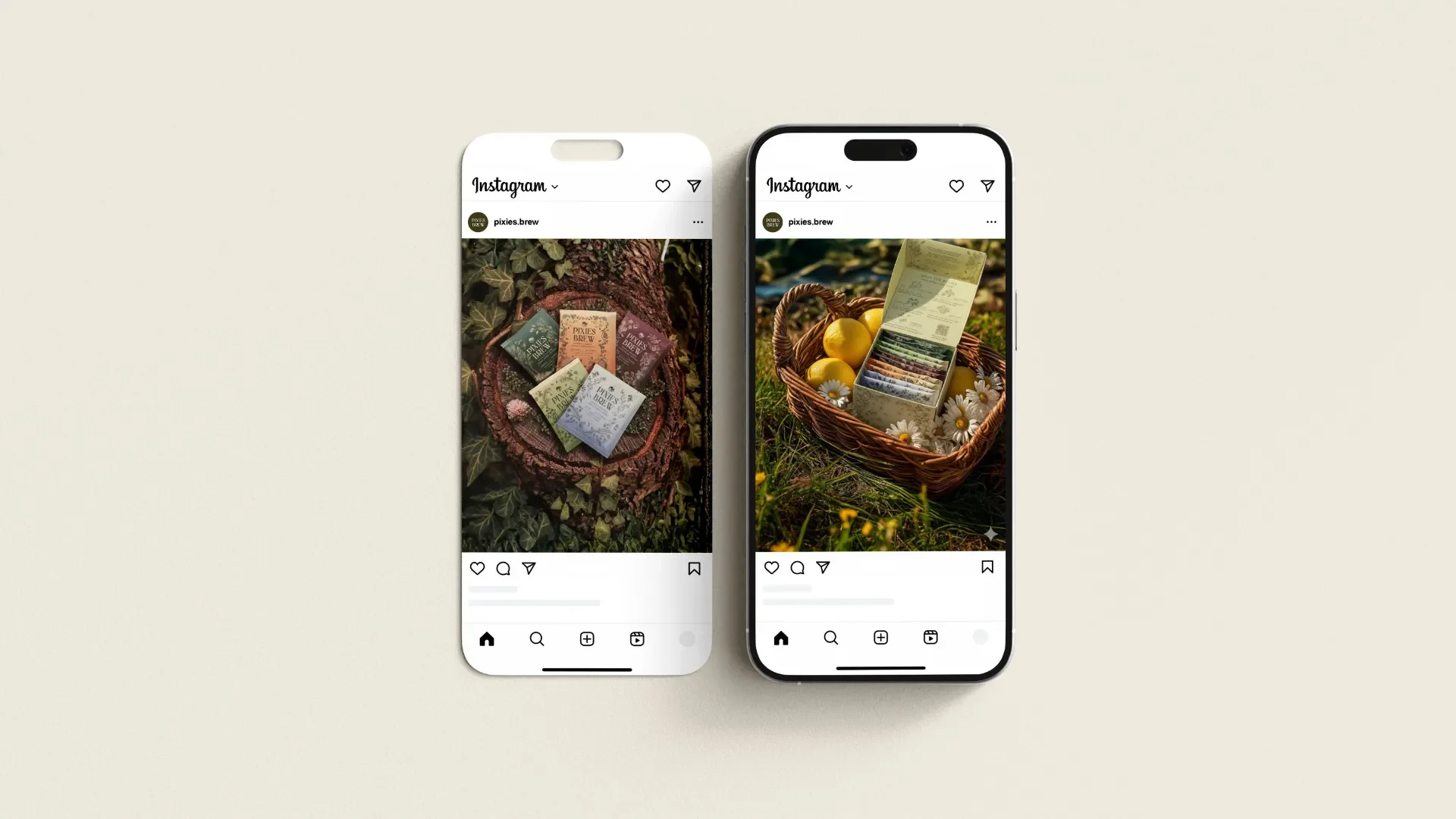
The photography needed to capture the earthy, whimsical spirit of the brand. I crafted a visual direction that highlighted the packets, the illustrations, and lifestyle scenes that reflect how customers enjoy Pixies Brew.
The results
Pixies Brew launched with a complete brand world rather than a single product. Every piece works together. The packaging, brand identity, website, and copy create a unified experience that feels fresh in the coffee market.
The final result is a fully realized brand that stands out immediately and helps customers feel connected from the very first glance.
A note from the founder
“Whitney has amazing eyes for style and visual cohesiveness. She is very professional, super responsive, and very efficient in putting the work together. She was also flexible in taking on additional scope of work when the project required. The results were amazing and I feel like the brand and package design were very much aligned with my vision which is all I could ask for. Highly recommended and would work with again. Thank you Whitney.”
Key takeaways
A whimsical concept becomes powerful when supported by strong strategy
Bold typography and soft illustration create balance when used with intention
Packaging works best when it guides, informs, and delights
A fully unified brand experience builds trust from the first interaction
