Calling Beauty // Vegan, cruelty-free skincare brand
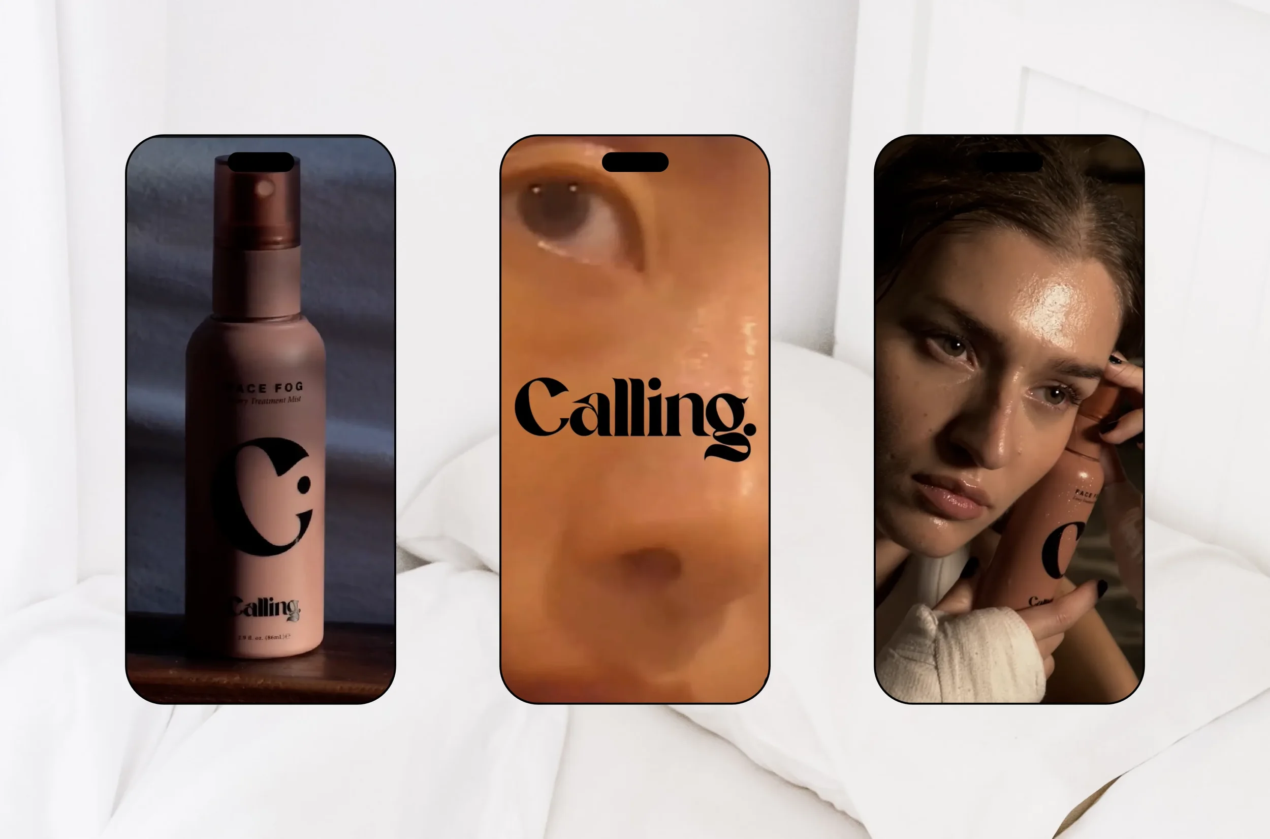
Calling Beauty is an eCommerce skincare brand offering “A soothing mist that seamlessly fits into your everyday ritual, for a fresher face on speed dial.”
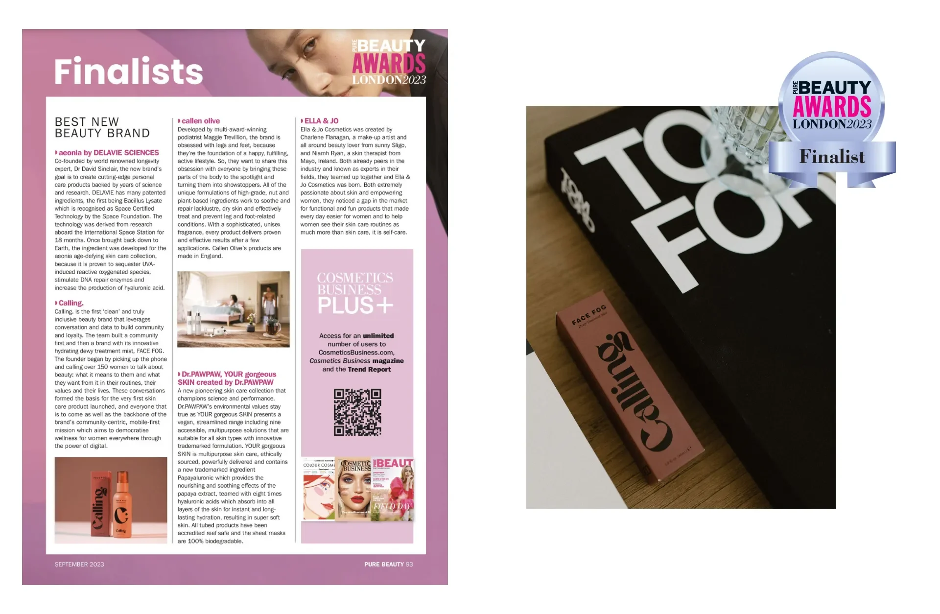
Calling is beauty that listens. They’re bringing a new, community-first approach to the beauty industry. Instead of building a community around their brand, they first interviewed 150 women and built a product around their beauty needs. They take your voice into account so they can offer products that are exactly what you’ve been yearning for.
Services:
Packaging Art Direction
Product Packaging Design
Introducing Calling Beauty
Calling Beauty is an award-winning clean beauty brand created for modern women who want skincare that feels good and actually works. Their product line is intentional, thoughtful, and shaped by real community feedback. The brand lives by its promise of beauty that listens.
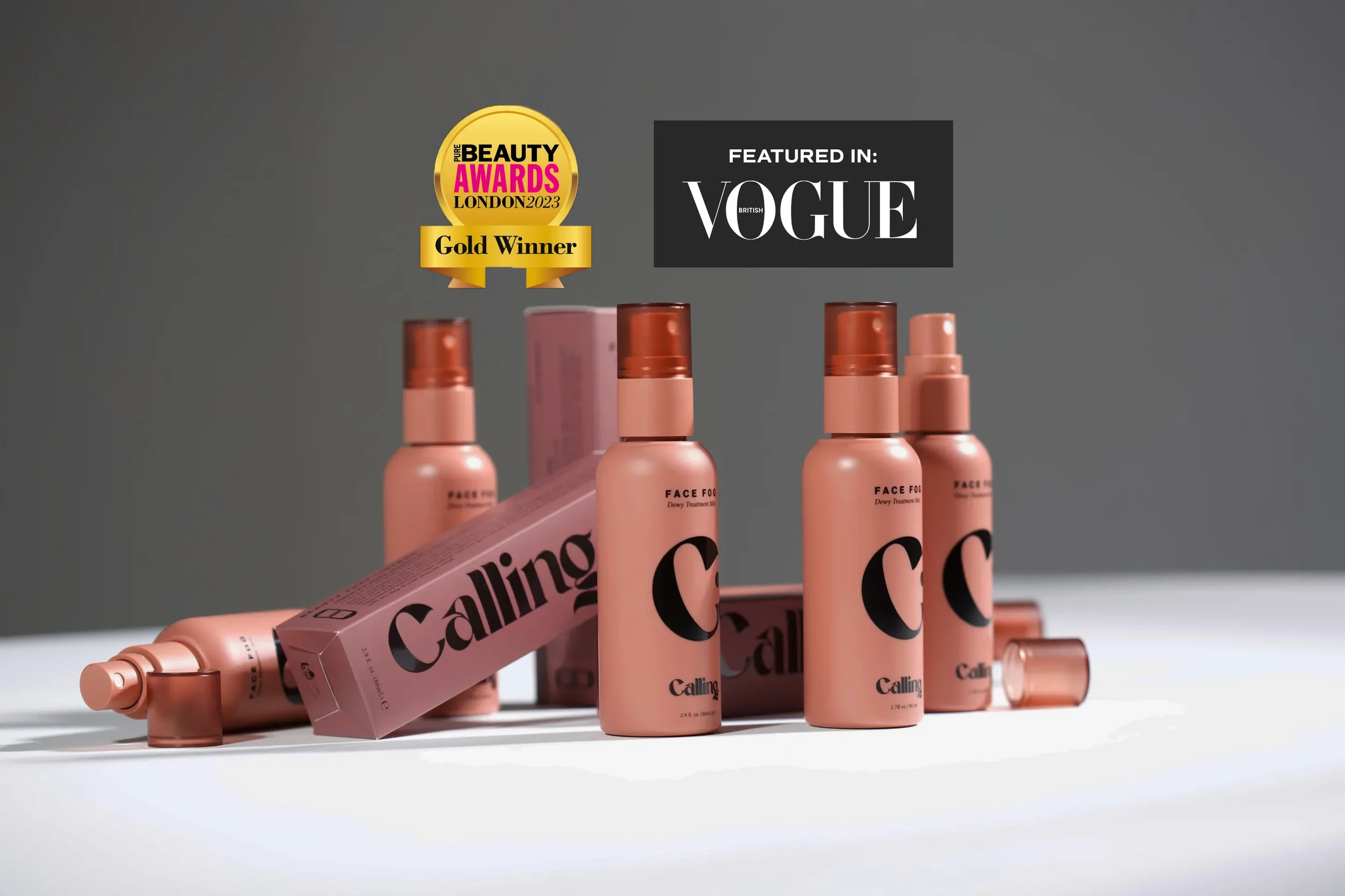
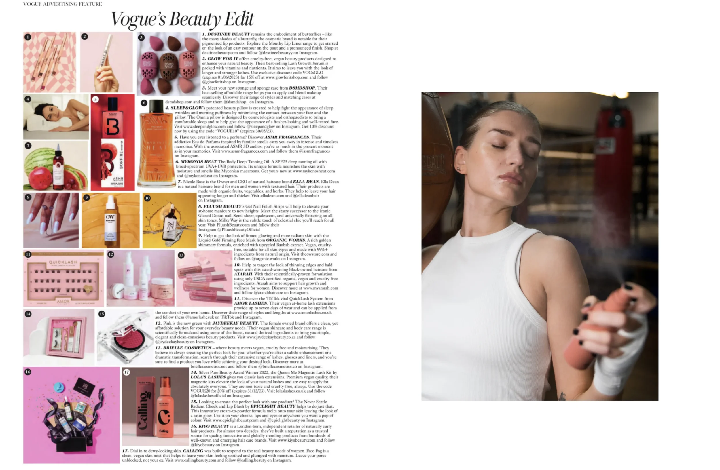
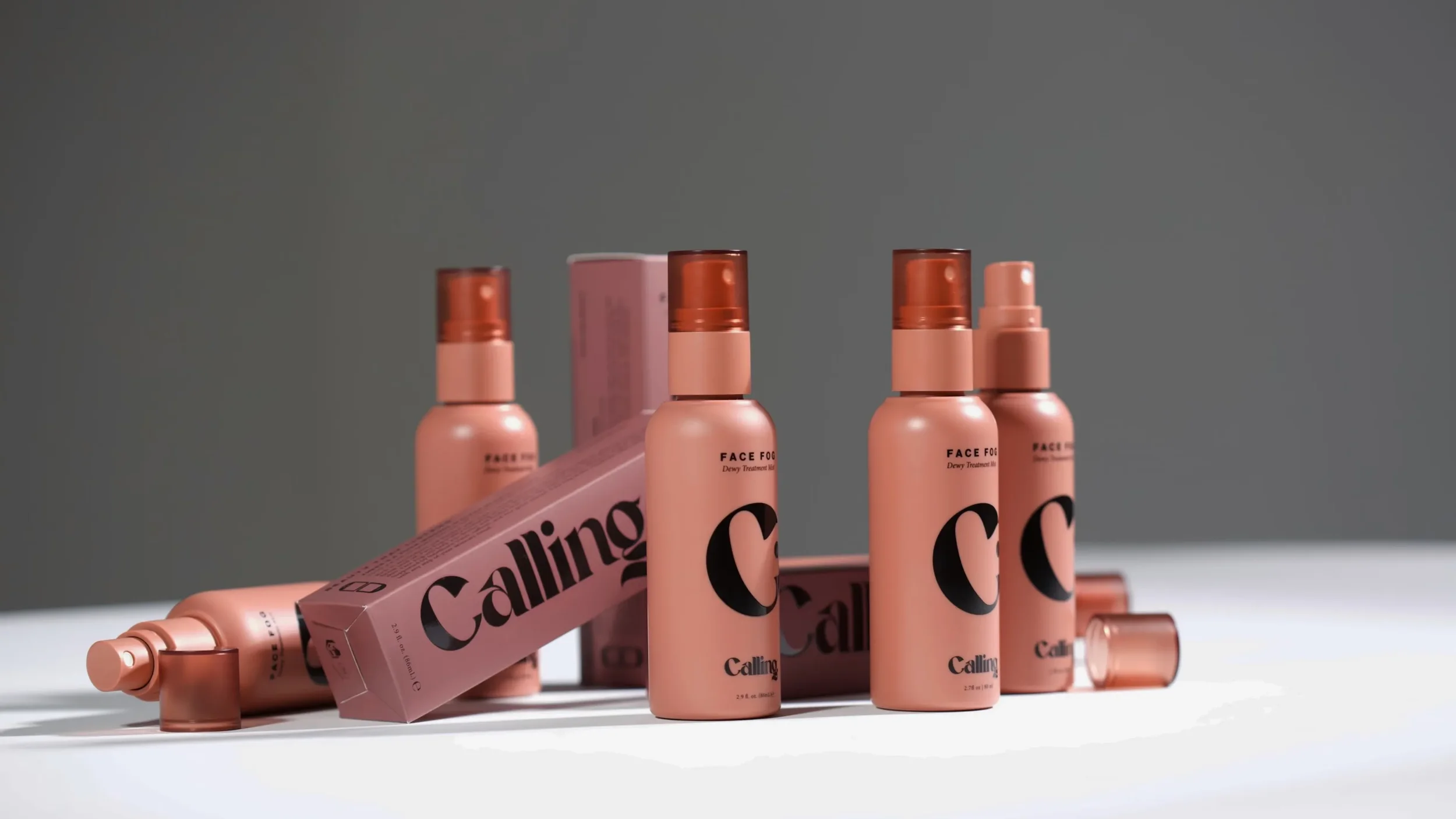
With three hero products, three Vogue features, and multiple Pure Beauty Award wins, Calling is a fast-growing name in the clean beauty space. Founder Sabah came to WildHive with a formula she believed in. Face Fog was ready, but the packaging still needed to reflect its quality, price point, and potential.
She wanted something modern, minimal, high-end, and worthy of the brand’s big launch debut.
The Challenge
Sabah had her formulation complete, but the packaging did not communicate the same level of refinement.
Face Fog needed:
a premium feel to match the product itself
a visual presence that stood out immediately
a minimal aesthetic with personality
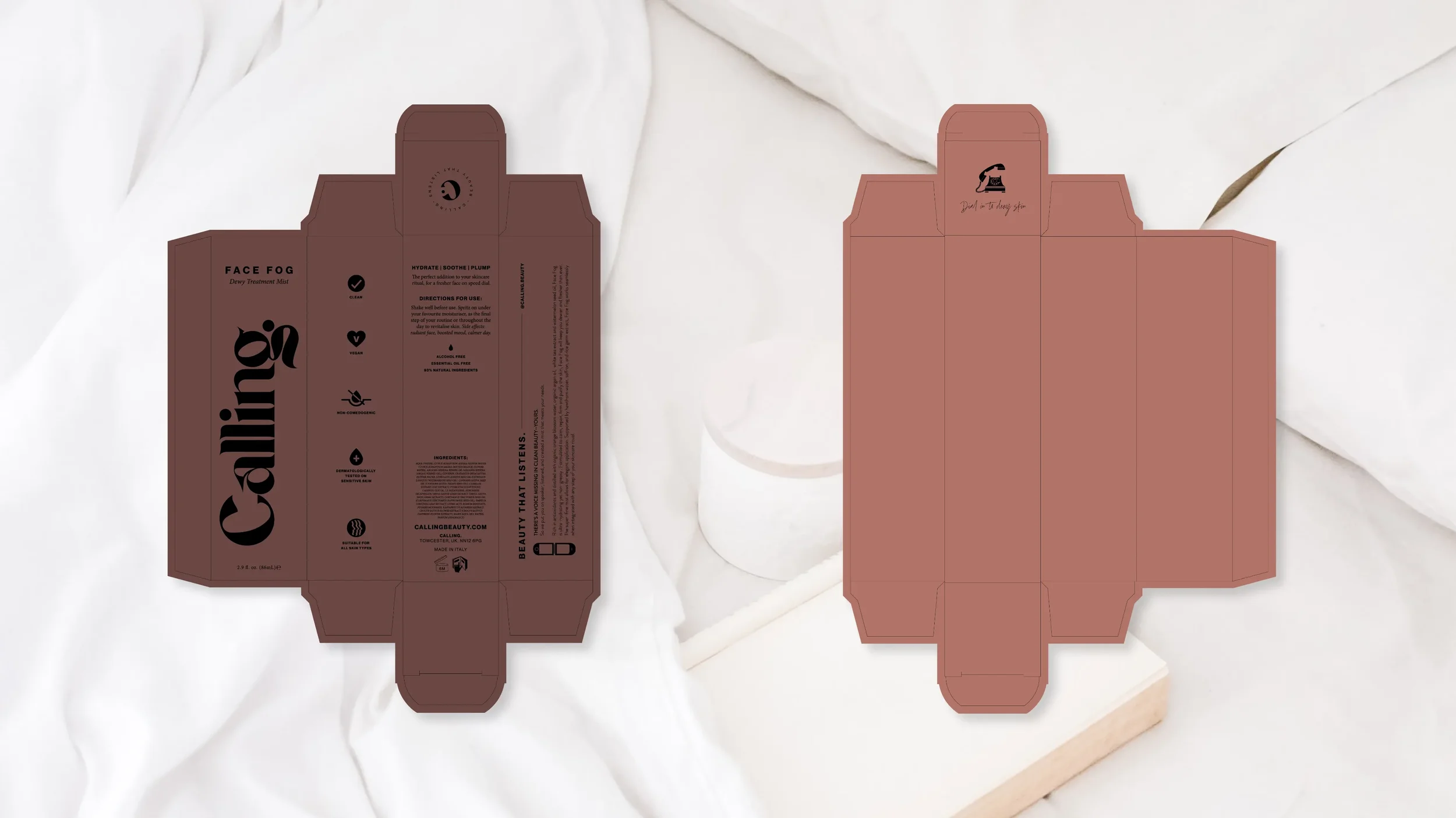
production-ready files that manufacturers could execute without confusion
She knew the product was exceptional. She needed the packaging to support the story.
The Approach
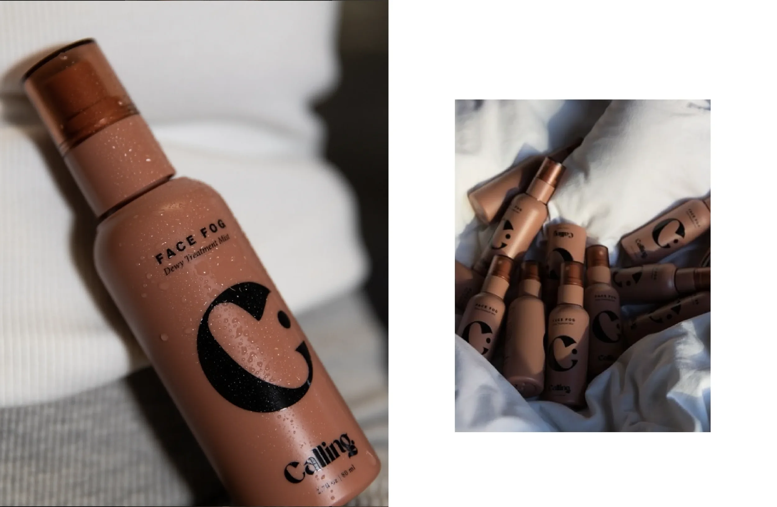
From the beginning, the plan centered on two goals: create luxury and make the design easy to share. Clean beauty customers respond to refinement, and influencers gravitate toward products that photograph beautifully. Face Fog needed both.
Here is what guided the design:
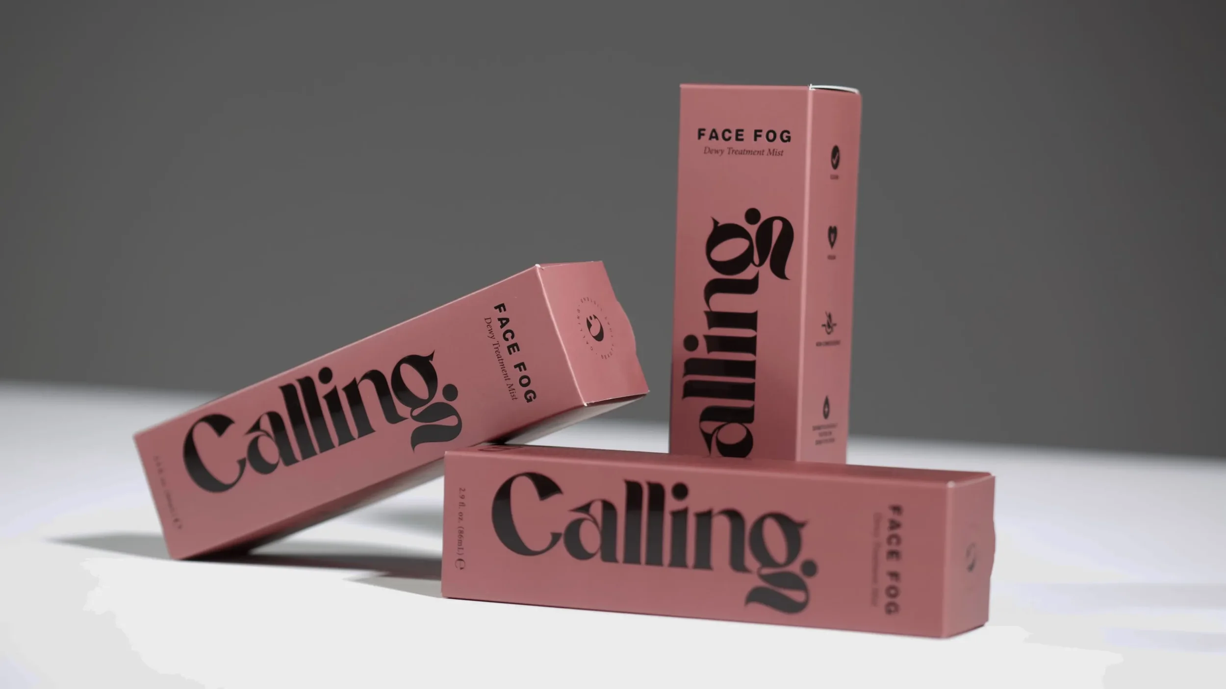
A bold, minimal layout
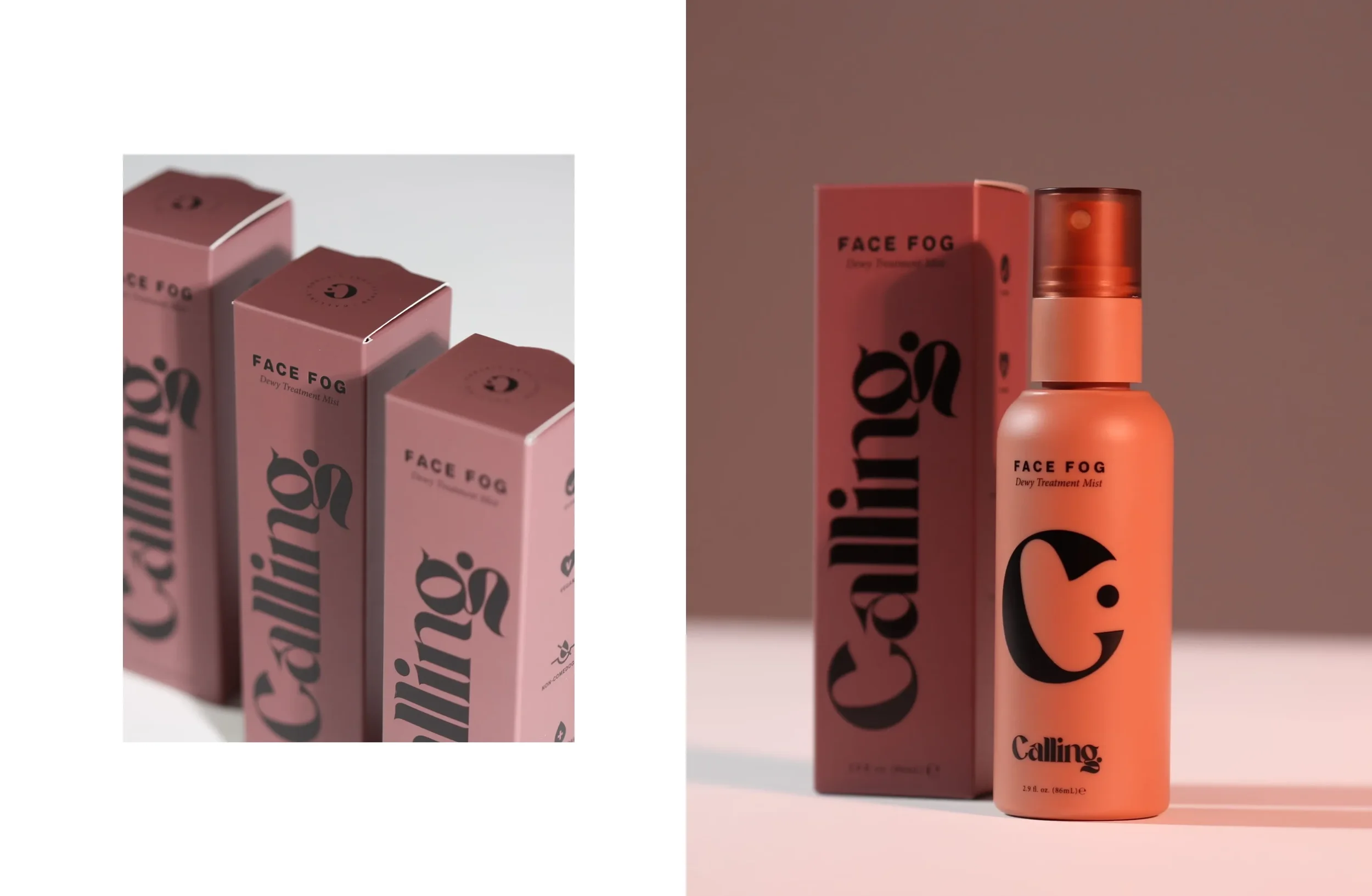
Simplicity works when it has intention behind it. The main layout gives clarity at a glance and feels confident on shelves and in lifestyle photos.
Embossing and spot gloss
Texture communicates quality. These finishes add depth and elevate the unboxing moment without cluttering the design.
An airy composition
Generous negative space and modern typography create a calming, luxurious feel. It mirrors the experience of the mist itself.
Marketing-led decisions
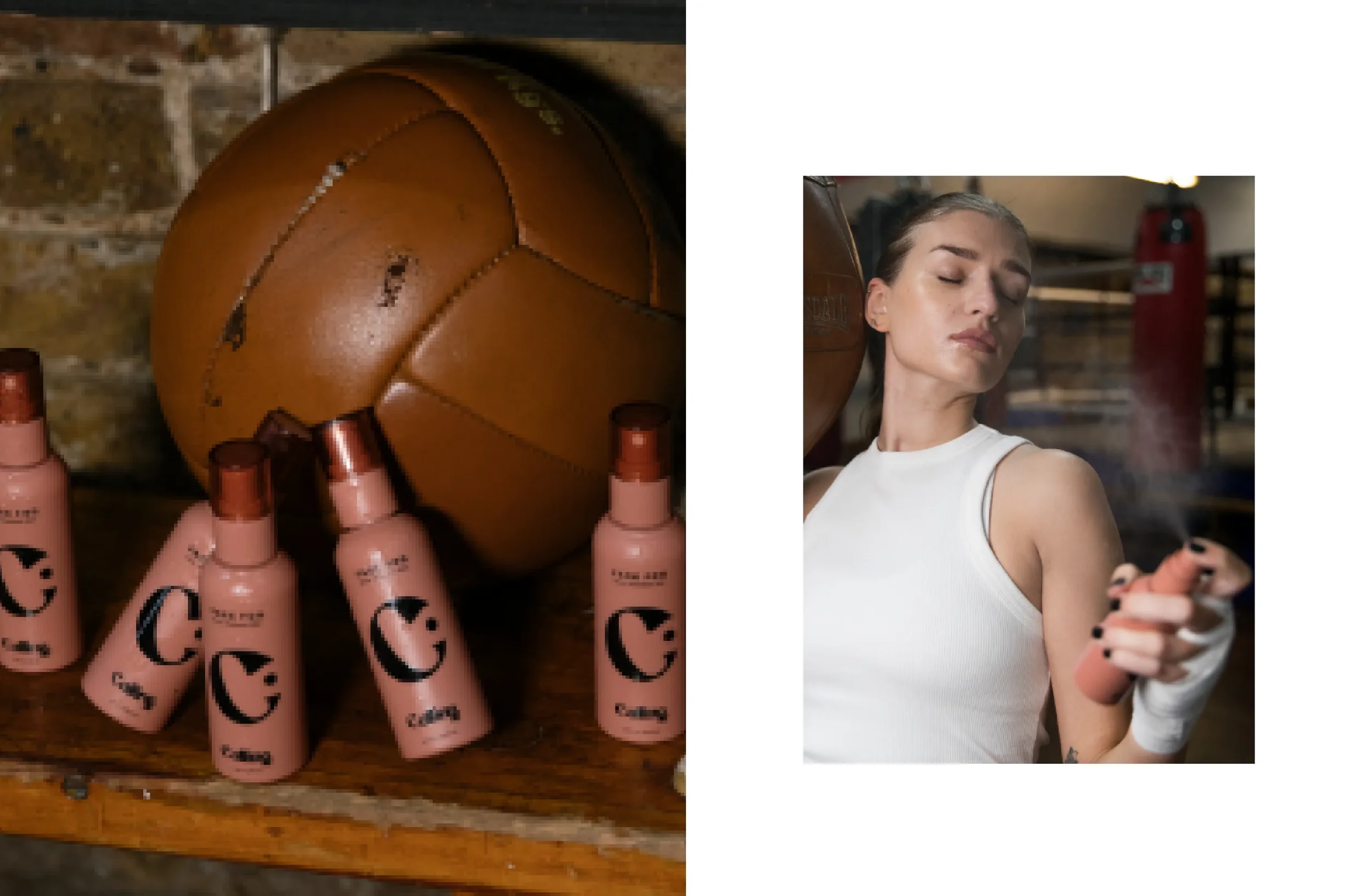
Every detail was chosen with social visibility in mind. A beautiful design encourages customers and influencers to share it without prompting.
Design and UX decisions
Packaging may not be a website, but it still needs clarity, hierarchy, and intention. These are the same principles that guide strong user experience.
Clear hierarchy
The name “Face Fog” reads instantly. Supporting copy is clean and easy to skim. The customer never has to wonder what the product does.
Negative space with purpose
Luxury often comes down to spacing. The design breathes, which makes it feel elevated the moment someone picks it up.
A cohesive system
The bottle and the box share structure, tone, and energy. The customer experiences a sense of continuity from the shelf to their home.
Technical production support
Packaging design becomes its most challenging during production. I supported Sabah through each step so she never had to guess. This included:
managing printer requirements
refining dielines
selecting where emboss and gloss should fall
reviewing color accuracy
preparing all finishing notes
The goal was to create packaging that looked beautiful in hand and printed flawlessly.
Key metrics and results
Strategy and intention translated directly into momentum.
Face Fog went on to:
be featured in British Vogue three times
win Gold at the Pure Beauty Awards in its launch year
serve as a packaging launching pad for Calling Beauty expand into two more successful lip-care products
For a first product launch, this type of traction speaks for itself.
A note from the founder, Sabah
“WildHive Studio is a gem of company, rooted in creativity, strategy and patience. Great design takes time, vision and communication. Whitney possesses all of these qualities. My personal experience with her has been incremental to successfully designing packaging but also dealing with the oftentimes difficult specifications of putting it into production. She is committed to getting every last detail right and makes you feel like you have a support team around you, even as a solo founder. She is class, integrity and a solid investment in your business. A no-brainer, sign on with her!”
Key takeaways
Luxury comes from intention and detail
Packaging that photographs well earns more organic visibility
A strong packaging system builds trust before the customer even tries the product
Ready for packaging that elevates your next launch?
If you want packaging that feels high-end, supports your marketing, and makes customers take notice, let’s talk. Your products deserve a visual presence that works as hard as you do.
Explore the final product here: https://callingbeauty.com/en-us/products/face-fog?selling_plan=29069803740&variant=42442894934236
