Whitney, your WORK is OUTSTANDING!!!!!! Seriously First Class Work!!! It's all coming together! WOO HOO!!! THANK YOU AGAIN!!!!!
- Marina, Founder of Trust Your Gut


How Trust Your Gut elevated its brand identity and packaging to stand out as a modern, credible wellness leader
Meet Trust Your Gut
Trust Your Gut is a Phoenix based wellness brand committed to helping people reconnect with their bodies through simple daily rituals rooted in gut support. Their product line includes premium enema kits, high quality castor oil, soft castor oil wraps, digestive teas, and non toxic candles. Each product is intentionally formulated to help individuals reduce inflammation, improve digestion, and cultivate a more grounded sense of well being.
While the brand is still young, their presence in the wellness world has been growing rapidly. They have been featured on respected podcasts such as Culture Apothecary with Alex Clarke and have begun earning endorsements from holistic practitioners and gut health specialists. Their customers appreciate high quality wellness products that are natural, effective, and easy to use without feeling intimidating.
From the beginning, the founder wanted the brand to feel warm, friendly, and supportive. Gut health can be a vulnerable topic. Many customers come to the brand because they feel discomfort, confusion, or discouragement. Trust Your Gut was created to be a place where those feelings were met with clarity, calmness, and compassion.
The challenge
Before working with WildHive, Trust Your Gut partnered with a designer to develop their first round of branding and packaging. However, the direction they received did not reflect their vision or the type of customer they wanted to attract.
The original branding leaned toward a baby inspired, mother centric aesthetic. The colors were soft and pastel. The shapes and typography felt too playful. While the work was well intentioned, it did not feel aligned with a modern wellness brand. It also did not reflect the grounded, nature focused, and quality driven experience that the founder wanted customers to have.
Instead of feeling credible and wellness oriented, the original branding looked juvenile. This can be damaging in the gut health category, where customer trust is essential. A person considering an enema kit or castor oil wrap needs packaging that feels safe, clean, and intentional. Soft baby colors and overly whimsical shapes do not communicate that sense of trust or professionalism.
The brand needed a sophisticated identity that balanced modern minimalism with organic warmth. They needed packaging that felt high quality on a bathroom shelf and also looked cohesive and elevated on the website and social media. The visual identity needed to support their growth into new products, affiliate partnerships, practitioner endorsements, and future retail opportunities.
My approach
The first step was to understand the emotional landscape of the customer. Gut health can feel overwhelming. For many, it is a topic filled with confusion and discomfort. The visual identity needed to counter that with clarity and calmness. It needed to feel grounded in nature but not rustic. It needed to feel modern but not clinical.
I guided the brand toward an identity rooted in three pillars:
grounded warmth
functional clarity
modern wellness sophistication
Every design choice supports these pillars.
Understanding the brand personality
Trust Your Gut is approachable and friendly. Their tone is supportive and educational. Their products are high quality but not priced like luxury items. The visuals needed to reflect this balance so the brand felt accessible without feeling low end.
Typography that feels modern and clear
Typography is one of the most important elements of wellness branding. I selected a combination of clean serif and minimal sans serif fonts that create an elevated but approachable feel. The fonts are modern and elegant, yet soft enough to feel human. This balance allows the brand to appear credible and trustworthy without intimidating beginners.
The type hierarchy was designed to guide customers through clear instructions, benefits, and usage details. This is especially important for castor oil wraps and enema kits, which require customers to feel confident and informed.
A color palette inspired by earth and nature
The new color palette features earthy neutrals and grounded tones that align with the brand’s natural formulations. These colors help customers feel calm and reassured. They also differentiate the brand from overly clinical competitors that lean toward blue and white color schemes.
The palette includes deep neutrals, warm browns, muted greens, and soft ivory shades. These tones communicate natural support and help the packaging feel at home in both minimalist bathrooms and wellness clinics.
A meaningful symbol
The brand icon became the centerpiece of the identity. The symbol represents two hands gently supporting a stomach while forming a botanical shape. It represents nourishment, care, and connection.
This icon helps communicate the heart of the brand. It is simple enough to be memorable and meaningful enough to be used across packaging, website elements, social media graphics, and future product launches.
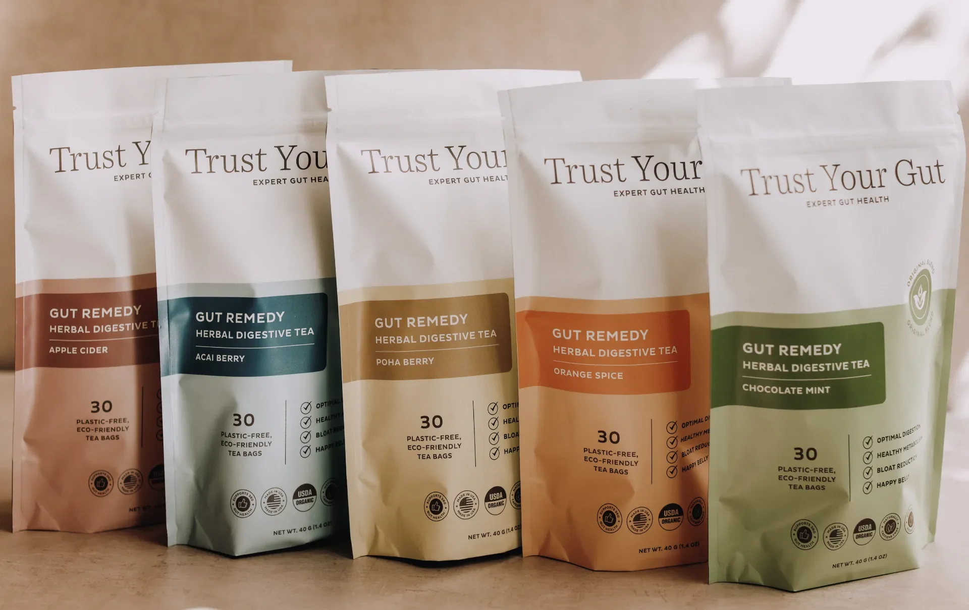
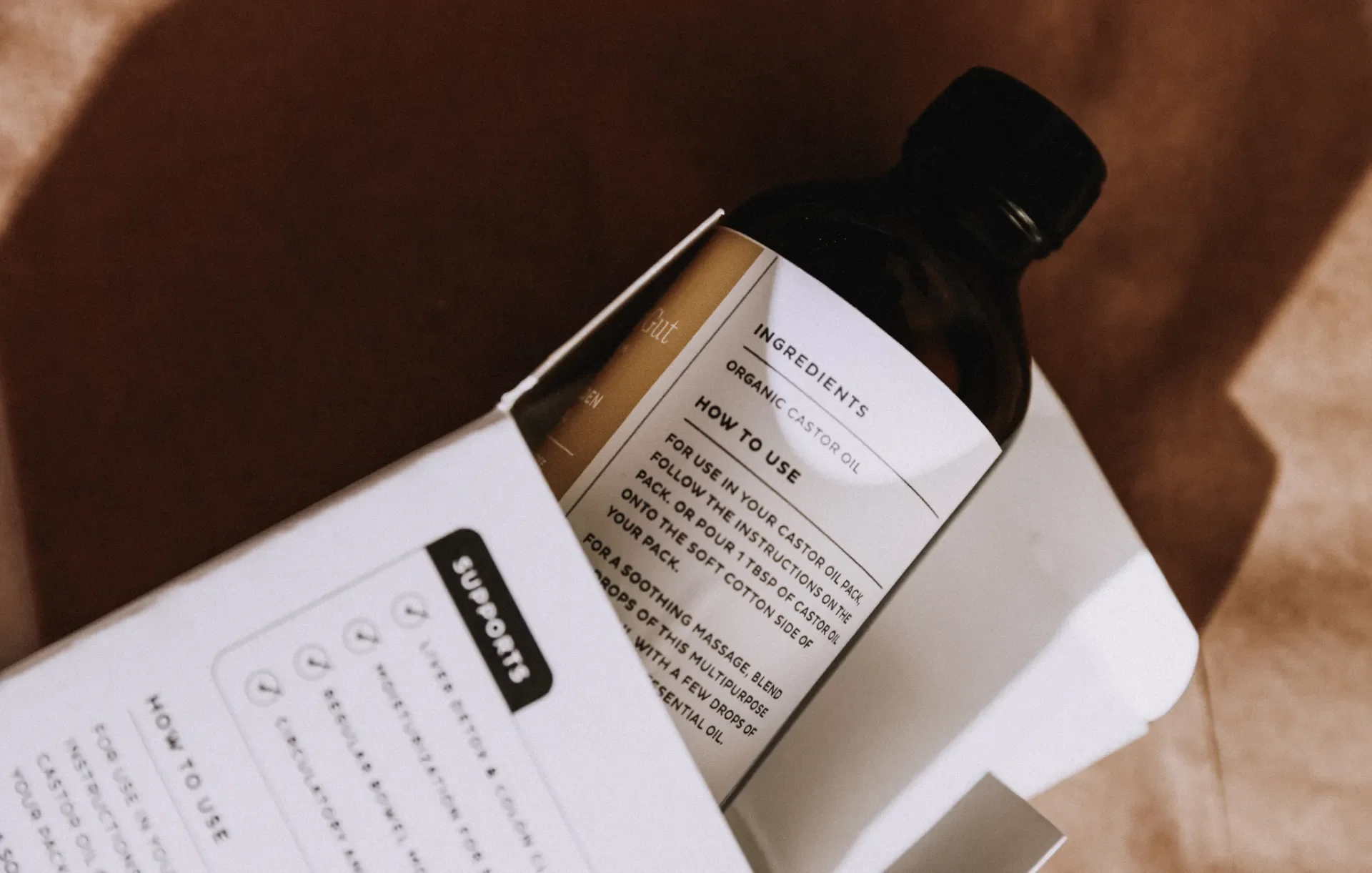
Packaging design
Once the visual identity was complete, I designed the packaging system for each product. Packaging plays a critical role in wellness because customers need immediate clarity and trust.
A calm, clean layout
I used spacious layouts that let the products breathe visually. The clarity helps customers immediately understand the product’s purpose. There is no clutter, no unnecessary decoration, and no distracting visuals.
Straightforward, friendly language
The packaging uses simple, conversational language that aligns with the brand’s friendly personality. Instead of overwhelming customers with technical terms, the wording focuses on clarity, calmness, and ease of use. This helps beginners feel empowered and confident.
High quality structure and finish
Although the brand is priced affordably compared to competitors, the packaging needed to look and feel premium. I selected finishes and layout structures that help the products appear thoughtful and well crafted.
Ingredient and usage highlights
Wellness customers want to understand what they are putting on or into their body. Each package clearly highlights:
natural ingredients
ethical sourcing
the product’s primary benefit
clear usage instructions
This transparency builds trust and supports conversion both online and in person.
Photography direction
I guided the founder through photography styling that matched the new brand identity. This included lighting, backgrounds, props, and product arrangement. The photos needed to look warm, earthy, and intentional so that the packaging and website felt cohesive.
Consistency across platforms
After the rebrand, I continued to support Trust Your Gut with:
social graphics
website updates
educational materials
new product packaging
content strategy guidance
This consistency helps reinforce the brand and ensures that every customer touchpoint feels intentional and cohesive.
Results
The new brand identity and packaging helped Trust Your Gut reposition itself in the wellness market. The sophisticated, minimal identity instantly elevated the brand’s credibility. As a result, they gained traction on social media, saw increased website sales, and expanded their presence on Amazon.
They have been featured on multiple podcasts and have attracted gut health specialists who now recommend their products. The clarity and professionalism of the packaging make the products easier to sell, easier to understand, and easier to share online.
They launched new products confidently and expanded their community through education and affiliate partnerships. Their growth continues to accelerate as their brand recognition strengthens.
Why this project worked
This branding and packaging project succeeded because it centered the emotional needs of the customer. It created a sense of trust, calmness, and clarity. It honored the brand’s natural ingredients, friendly price point, and supportive mission.
Success came from:
a grounded visual identity
packaging that educates without overwhelming
a modern design system built for long term growth
a meaningful icon that brings emotional resonance
consistency across packaging, website, and social content
Trust Your Gut now has a unified identity that supports growth, credibility, and long term brand recognition.
Ready for a wellness brand and website that feel as trustworthy as your products?
If you want branding, packaging design, and a Shopify experience that elevate your presence and communicate your value clearly, I would love to help.