“Whitney from WildHive Studio was an absolute dream to work with. She is incredibly organized, clear, detail oriented and a very easy going person to pass ideas back and forth with. Her attention to detail for the vision we gave her was spot on, and its incredible the speed at which she can put everything together.
We loved every moment of the experience we had with her on this website and will be calling her for everything and anything Shopify moving forward. Her professionalism and quality of work is unmatched, do yourself a favor and set up that onboarding call with her, you won't be disappointed.”
— Founder of Waevera

How Waevera launched a clean, conversion driven Shopify website that tells their story and elevates their protein brand for modern wellness shoppers
Meet Waevera
Waevera is a clean protein powder brand created for people who want high quality, trustworthy, non inflammatory nutrition that supports the body without compromising on taste or integrity. Their philosophy is rooted in simplicity and science backed formulation. Waevera believes that wellness should feel natural, intuitive, and grounded in ingredients that actually make a difference.
Their products are developed with care and intention. No fillers. No artificial anything. No shortcuts. Just thoughtful ingredients designed to nourish the body well. The brand exists for health conscious individuals who want to feel strong, supported, and energized without turning to chalky, synthetic, or confusing protein powders that dominate much of the market.
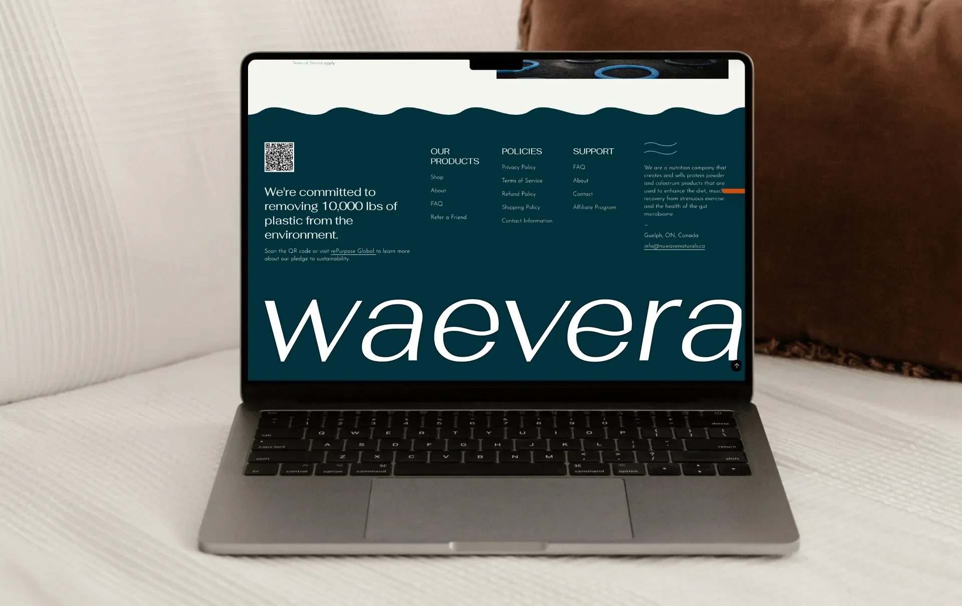
Waevera’s about page shares the story behind the brand’s creation. It was born from the founder’s personal health journey and the frustration of searching for clean protein powders that truly aligned with functional nutrition values. They wanted something that prioritized gut health, absorption, and taste without the compromises that many consumers have grown used to. Instead of accepting low quality options, they decided to create their own.
That story sits at the heart of the brand. Waevera represents clarity, honesty, and clean formulation. It was essential that their website communicated these values from the very first scroll.
The challenge
Waevera was preparing to launch and needed a professional Shopify website that could communicate their mission clearly, showcase their product benefits, and guide customers through the shopping experience with ease. As a new brand entering a competitive market, they understood the importance of having a site that could help them stand out immediately.
Their biggest challenges were:
translating their brand identity into a polished website
ensuring their story was told in a compelling and visually engaging way
creating a layout that made complex information easy to understand
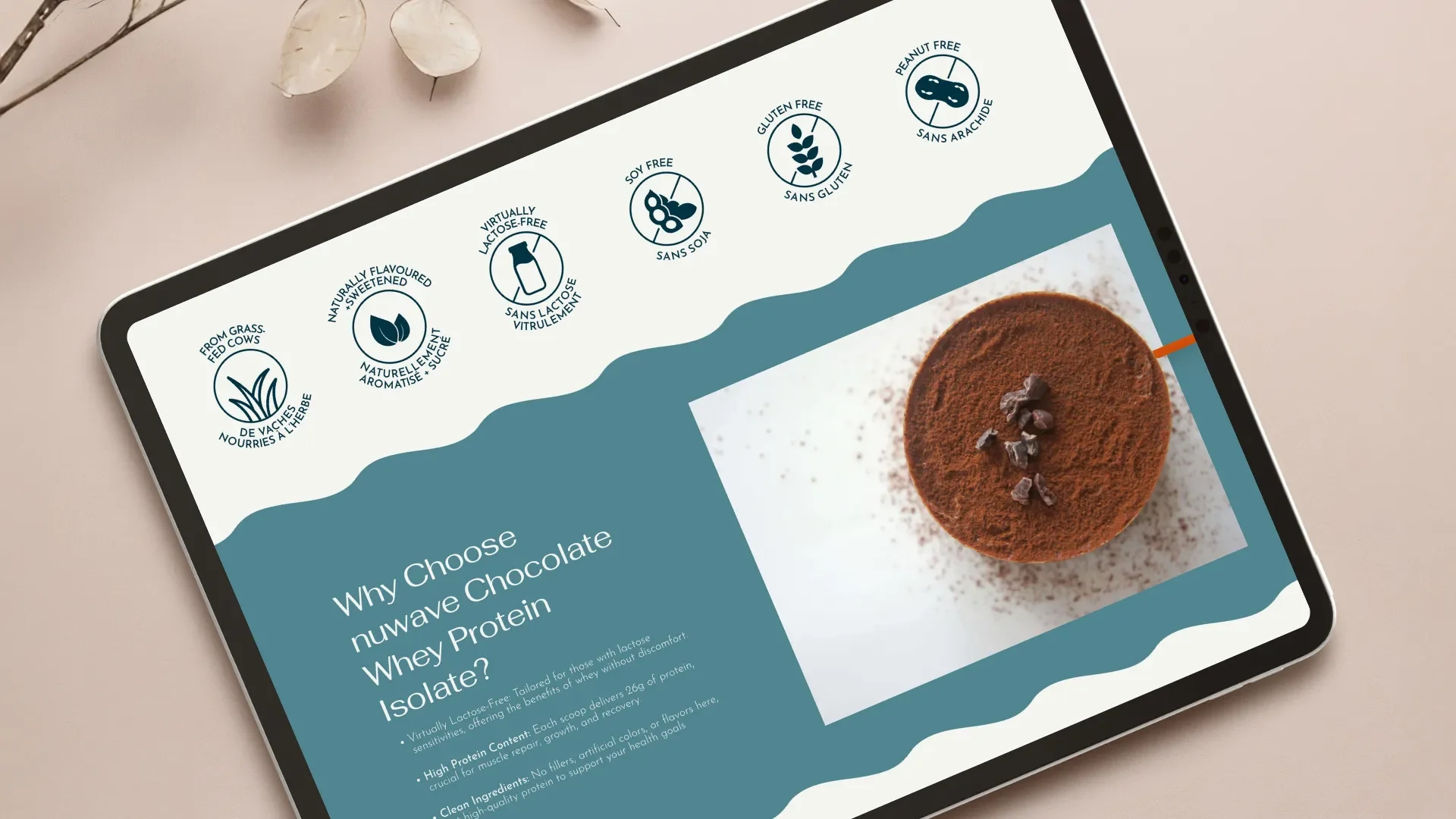
designing product pages that clearly communicated benefits and ingredients
organizing the site in a way that minimized customer confusion
building strong SEO foundations from the start
creating an experience that communicated trustworthiness and quality
Because clean protein shoppers are highly discerning, the website needed to feel intentional and credible. The brand had a strong visual identity, but it had never been applied to a digital experience. They needed a professional who could turn their strategy, visuals, and story into an interface that felt confident and unified from top to bottom.
Scope of work
Waevera hired WildHive Studio for a Shopify Website in a Week service. The goal was to create a complete, conversion driven website in a short timeline while still holding the highest standard of design excellence and brand cohesion.
The project included:
full homepage design
product page design and optimization
about page storytelling structure
clear navigation and user flow
custom layout sections aligned with the brand identity
UX strategy to guide customers through education and shopping
conversion focused layouts
FAQ creation and structure
mobile optimized design
SEO foundation and image optimization
implementation on Shopify’s latest theme framework
The final site needed to feel calm, clean, premium, and trustworthy. It needed to reflect the quality of the protein and the values of transparency, purity, and science backed wellness.
My approach
To bring Waevera’s vision to life, I centered the design around three pillars:
clean presentation
story driven visuals
conversion friendly structure
These principles helped define every page, section, and interactive moment throughout the website.
Translating the brand identity into digital
Waevera’s visual identity is modern, minimal, and rooted in the clean wellness aesthetic that health conscious shoppers expect from a premium brand. To translate that identity into a website, I focused on the elements that needed to come through digitally:
soft neutrals
high quality product photography
ample white space
intentional typography
gentle contrast
calm and clear visual hierarchy
These elements create a sense of trust and professionalism. When a customer arrives on the site, the experience feels peaceful and polished. Nothing is overwhelming. Every section guides the customer naturally through the story.
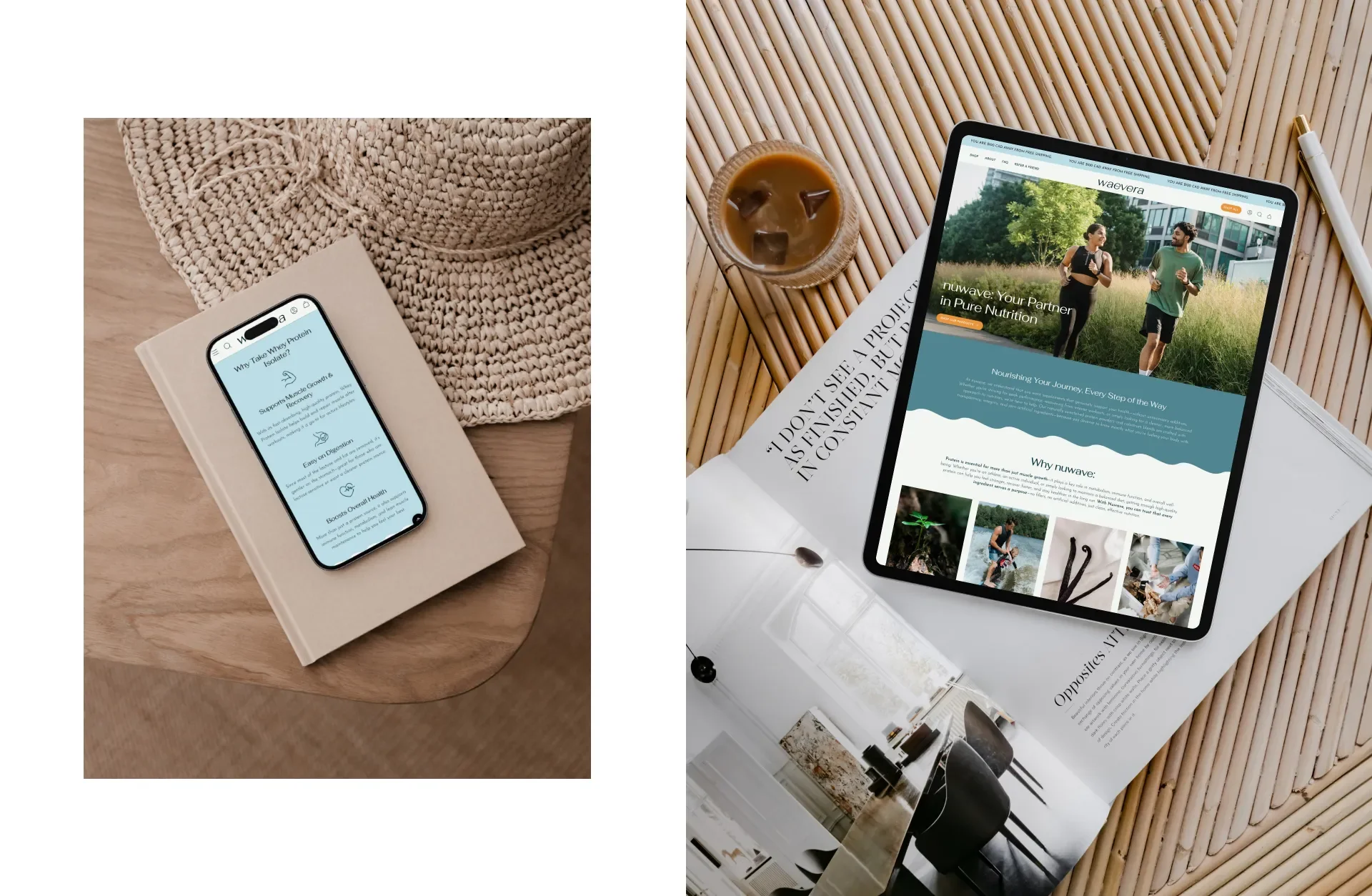
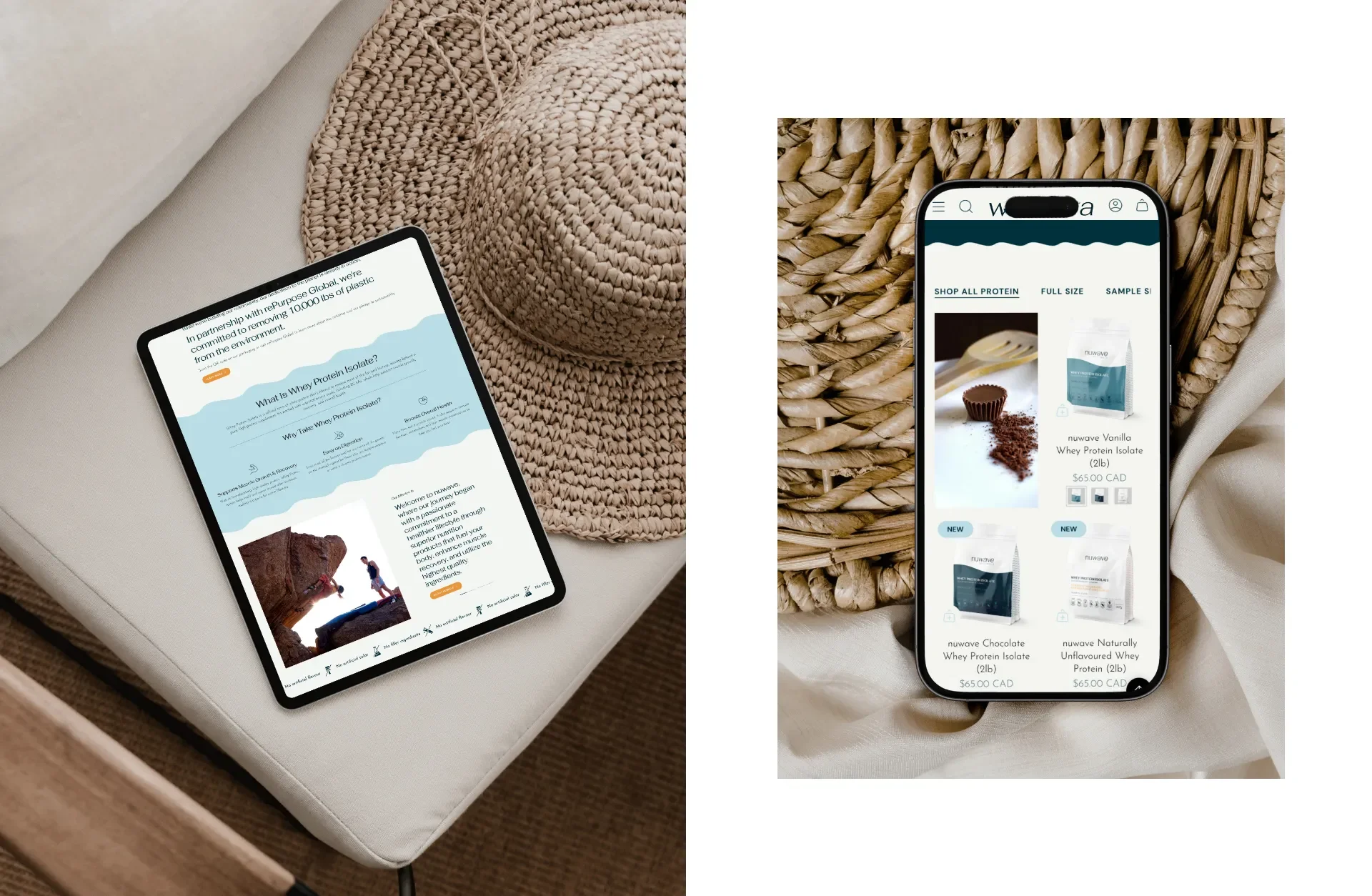
Creating a homepage that leads with clarity
The homepage needed to function as the foundation of the brand story. It introduces the values, communicates the product benefits, and helps customers understand what sets Waevera apart.
I designed a layout that moves through the following sequence:
clear value proposition
introduction to the product
visual breakdown of benefits
highlights of ingredients and formulation philosophy
gentle education on why clean protein matters
testimonials and trust building elements
direct paths to shop
The homepage is skimmable, visually clean, and intentional. Each block feels calm and informative without clutter or overwhelm.
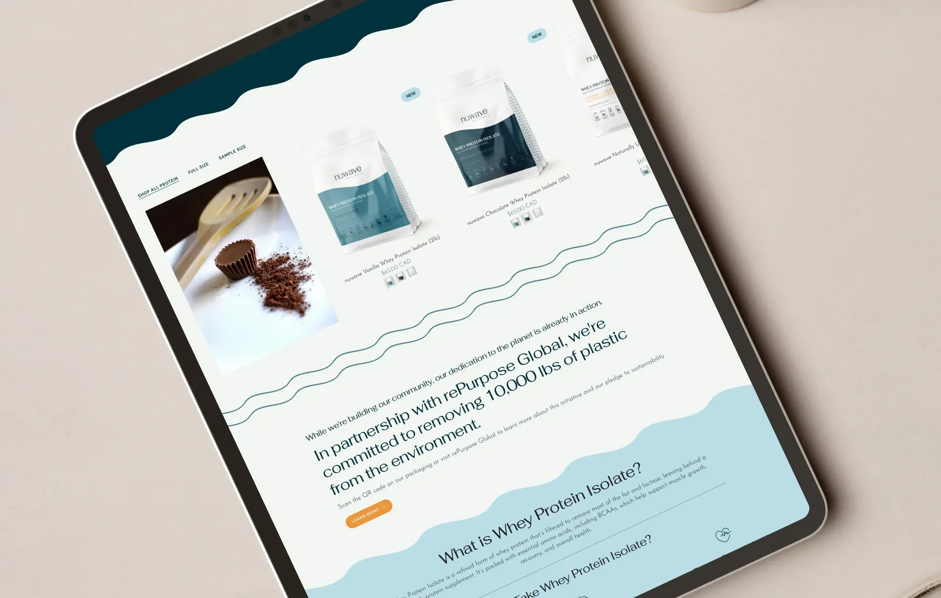
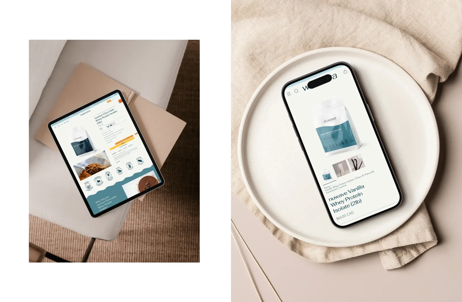
Product pages that educate and convert
Clean protein shoppers want information. They want ingredient transparency, nutritional clarity, and an understanding of the science behind the formula. They want to feel confident that they are choosing a product they can trust.
I built product pages designed to:
clearly outline product benefits
provide ingredient insights in simple language
offer quick scanning sections for busy shoppers
showcase high quality photos
organize information in digestible blocks
answer common questions within the page
connect customers to related information
The product pages help visitors feel supported in their decision. Instead of scrolling long paragraphs of text, they see structured information presented in a calm, organized way.
A visually engaging about page
The about page needed to feel like the heart of the brand. It needed to communicate the founder’s story, the inspiration behind the clean formulation, and the brand’s commitment to purity and quality.
I created a layout that:
balances storytelling with clean visuals
introduces the founder’s mission
uses simple language to explain the philosophy
highlights the importance of clean protein
integrates imagery in a calm, modern way
keeps the story personal without being overwhelming
This page builds emotional connection. It helps customers feel aligned with the values behind the brand.
FAQs that reduce customer confusion
Protein customers often ask similar questions:
How do I use it
What are the ingredients
How clean is the formula
Is it safe for daily use
How does it compare to other powders
What makes it different
To reduce customer support inquiries, I created a clear FAQ structure that answers these questions in simple, digestible language. This helps reduce contact form submissions and builds trust.
UX built for clarity
A wellness website must be easy to navigate. Clean navigation creates a sense of calm and professionalism, which is essential for conversion. I created a simple menu structure that guides customers through:
shop
product pages
about
FAQs
contact
This simplicity helps visitors move exactly where they need to go without confusion.
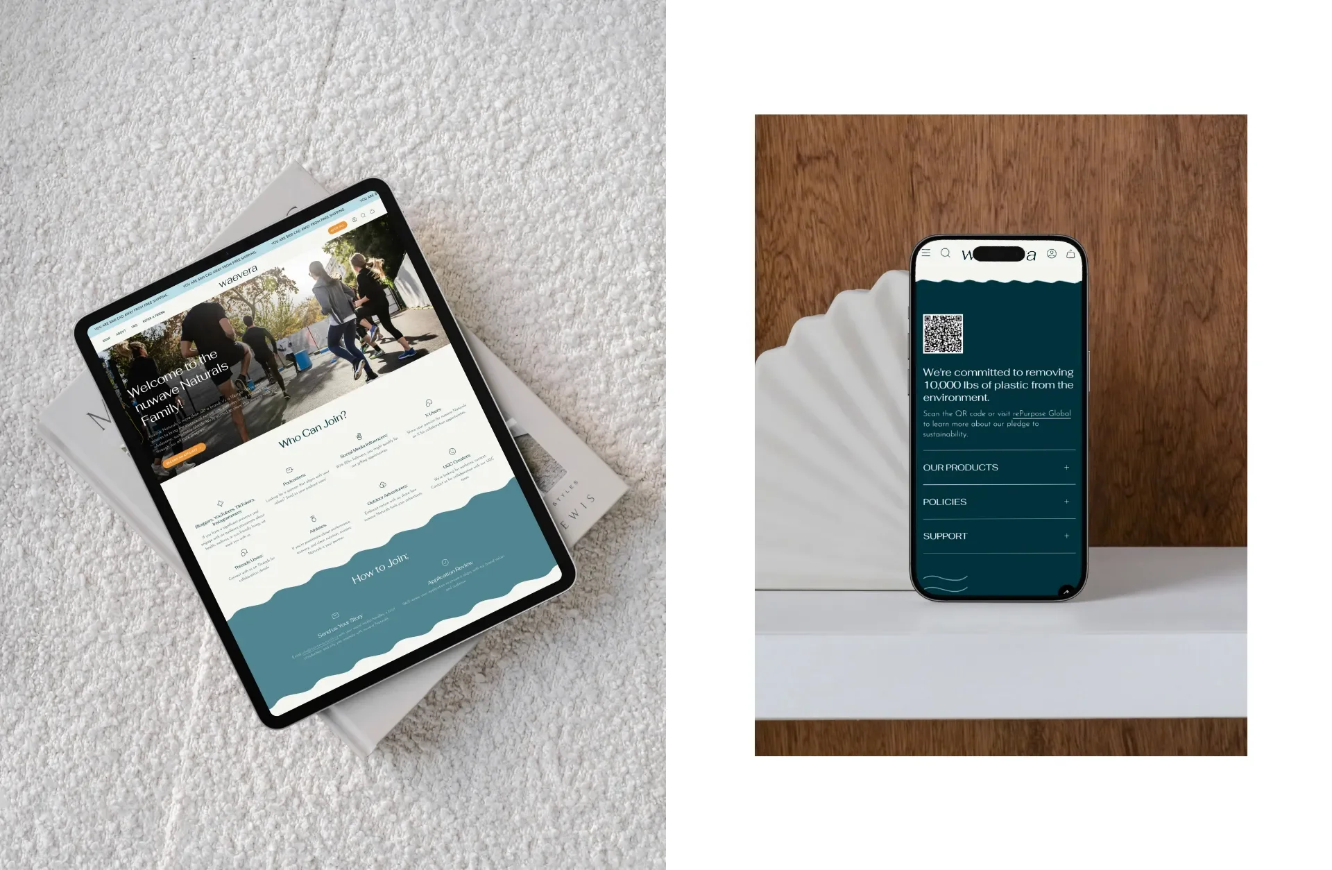
Building for mobile first
Much of Waevera’s traffic will come from mobile users through social media and organic discovery. I optimized every page for mobile, ensuring that:
text is readable
images scale cleanly
buttons are easy to tap
sections flow in natural rhythm
content feels balanced and not cramped
The result is a browsing experience that feels just as polished on a phone as it does on a desktop.
SEO foundations
To support long term search rankings, I built strong SEO foundations using:
keyword informed headings
clean URLs
optimized alt text
descriptive meta descriptions
schema friendly content
compressed images
balanced internal linking
Keywords such as clean protein powder, gut friendly protein, non inflammatory protein, and natural protein supplement are integrated in ways that feel natural and human.
This is not SEO that disrupts the reading experience. It is SEO that supports clarity and discoverability while staying aligned with WildHive’s human tone.
The results
The final Waevera website is a polished, cohesive digital home that reflects the purity and quality of the brand. It is clean, calm, and confidence building. It is easy to shop and easy to navigate. It communicates the product benefits clearly and gives customers all the information they need to make an informed choice.
The site now supports:
clear shopping pathways
digestible product education
strong trust building elements
smooth browsing experience
cohesive branded visual design
long term SEO growth
reduced customer support inquiries
a brand story told with clarity and heart
The team now has a website that feels aligned with their mission and supports future product expansions, education, and community growth.
Why this project worked
This project succeeded because the design honors the simplicity and integrity of the product. Every decision reflects the clean, grounded energy of Waevera. The visuals are calm. The structure is intuitive. The story is clear.
Customers arrive on the website and instantly feel the difference between Waevera and other protein brands. Nothing feels chaotic or overly sales driven. Instead, the experience communicates trust, quality, and modern wellness.
Key success factors include:
strong brand translation into digital form
calm, minimal visual design
clear storytelling structure
product pages built for education and conversion
mobile optimized experience
accessible content blocks
intuitive navigation
strong SEO foundation
thoughtful FAQ section that reduces friction
This combination of design, structure, and clarity allows the brand to stand out in an industry filled with noise.
Key takeaways
wellness websites need calm, organized layouts to reduce customer overwhelm
clear product pages increase conversion and trust
a well structured about page builds emotional connection
simplicity in design helps customers feel confident
strong SEO foundations are essential at launch
a cohesive brand identity is essential for long term growth